
 Workflow artwork
Marketing workflow · English
Paid campaign workflow
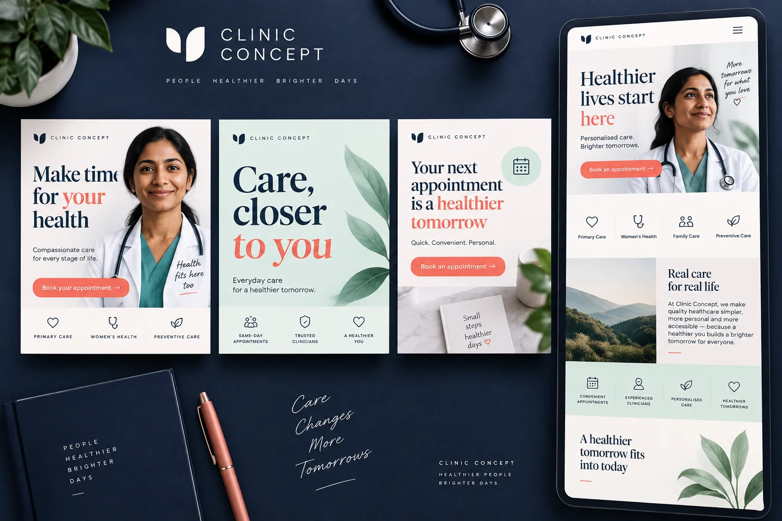
Editorial artwork for the paid campaign workflow in a healthcare marketing programme: planning, publishing and review.
Three complementary ad creatives and an appointment-focused landing-page design.
Independent studio design by Branding Pioneers — not a commissioned client project.
Behind the work
The brief
Three complementary ad creatives and an appointment-focused landing-page design.
Design decisions
Want something like this for your practice?
Discuss a project like thisMore in this discipline
Workflow artworkMarketing workflow · English
Editorial artwork for the paid campaign workflow in a healthcare marketing programme: planning, publishing and review.
 Studio design
Independent studio design · English
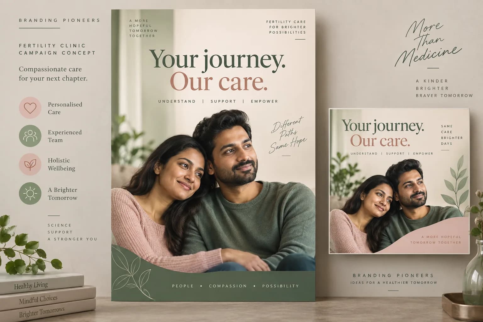
Fertility clinic poster and social campaign design in sage green and blush
 Studio design
Independent studio design · English
English healthcare poster design with Indian family portrait and blue and coral typography
Discuss your project
Three quick questions. We come prepared with a plan for your specialty and city.

 You’ll speak with a senior strategist
Where this work goes
This piece belongs to the paid advertising collection. On client work it becomes ad creative design and landing page design, delivered through our paid advertising work.
For the reasoning behind work like Clinic advertising and landing page, read the Google Ads for healthcare guide and is Google Ads worth it for doctors. See how a project runs from brief to delivery, or the client case studies for commissioned work.
Practical notes & supporting evidence
Design decision 1Build a consistent visual hierarchy across the collection.
Design decision 2Use a restrained navy, coral and ivory palette.
Design decision 3Let the work and its message remain readable at portfolio scale.
Clinic advertising and landing page explores this brief: Three complementary ad creatives and an appointment-focused landing-page design. The collection is labelled an independent studio design, and its published language is English. Its purpose is to explain the visual approach shown. Use that classification when citing the work, particularly when comparing concepts with commissioned client material elsewhere in the portfolio.
The recorded design decisions are: Build a consistent visual hierarchy across the collection. Use a restrained navy, coral and ivory palette. Let the work and its message remain readable at portfolio scale. Review each decision against the artwork. Look at the relative prominence of the primary message, the amount of supporting information and the way individual formats remain connected. When planning a similar assignment, identify which of these decisions meets your own brief and which needs to change for your brand, audience or service.
An advertising brief should name the service, eligible geography, patient action and landing page before it names the creative format. Check that the advertised appointment is actually available and that the intake team understands the enquiry it will receive. An ad can produce form submissions while the practice loses bookings through unanswered calls, unclear eligibility or unavailable clinician time. Record those stages separately so a creative review does not become a substitute for reviewing the appointment process.
Use the advertising account for spend and delivery data, then reconcile enquiries with the practice’s own booking records. Define a qualified enquiry before reporting its cost: include the service sought, location served and the information needed for the next conversation. Remove duplicates consistently. If the campaign includes multiple services, avoid merging their costs into a single attractive headline. An enquiry for an initial consultation and an enquiry for a complex procedure can have different requirements, decision windows and commercial value.
Review the message and the destination together. The landing page should explain the offer shown in the ad, identify the provider and answer the practical questions that prevent a visitor from contacting the practice. Forms should request the information needed for the first response without collecting a detailed medical history as a marketing requirement. Confirm that calls, forms and messaging buttons work on a real phone, including when a campaign starts outside staffed hours.
Choose one testable change at a time where practical: a clearer headline, a different audience definition or a shorter contact route. Keep the date of the change in the reporting log and compare it with an appropriate baseline. Campaign artwork demonstrates the content delivered, while platform reports demonstrate delivery within their stated definitions. Treatment outcomes need separate clinical evidence. A portfolio example can inform a brief, but it does not establish the budget or return a different practice will achieve.
Look first at the problem the collection addresses and the deliverables it actually contains. A website study can explain navigation and information hierarchy. A campaign collection can demonstrate how a message moves through different formats. Identity materials can show consistency across print and digital applications. These are useful design references, but each answers a different question. Choose the example closest to your intended task, then identify the parts you want to explore further rather than requesting a copy of the whole collection.
Write a brief that names your provider, audience, services, existing brand constraints and the action the work should support. Include content ownership and the practical destination of contact requests. When several stakeholders approve the work, agree who has the final decision on medical information, design and operational details. The clearer those responsibilities are, the easier it becomes to review a proposed layout without repeatedly changing the underlying service description or appointment process.
Read the collection at its intended size. Check whether the provider and message remain recognisable, whether supporting copy is legible and whether the next action is easy to understand. Look for consistent terminology across individual pieces. For multilingual work, have the wording reviewed by someone who understands the language and the service context. A translated message can change length, reading order and emphasis, so the layout needs its own review rather than an automatic text replacement.
Keep the distinction between independent studio concepts, client deliverables and editorial workflow artwork visible. Concepts explore possible design approaches. Client collections show the materials or engagement scope identified on their pages. Workflow artwork explains a process visually. None of these categories should be presented as an unverified client result. For a new project, confirm the release checklist and measurement plan separately from design approval, and make sure the source files and approval notes remain available to the team responsible for future updates.