
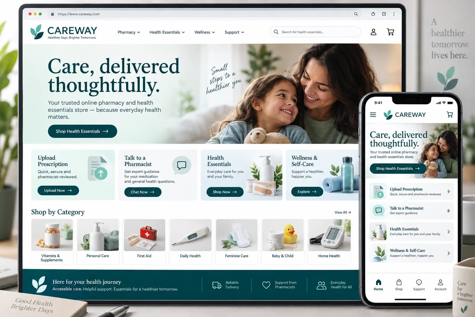
 Studio design
Independent studio design · English
Pharmacy and health essentials website
A pharmacy storefront design with prescription upload, pharmacist support and accessible product discovery.
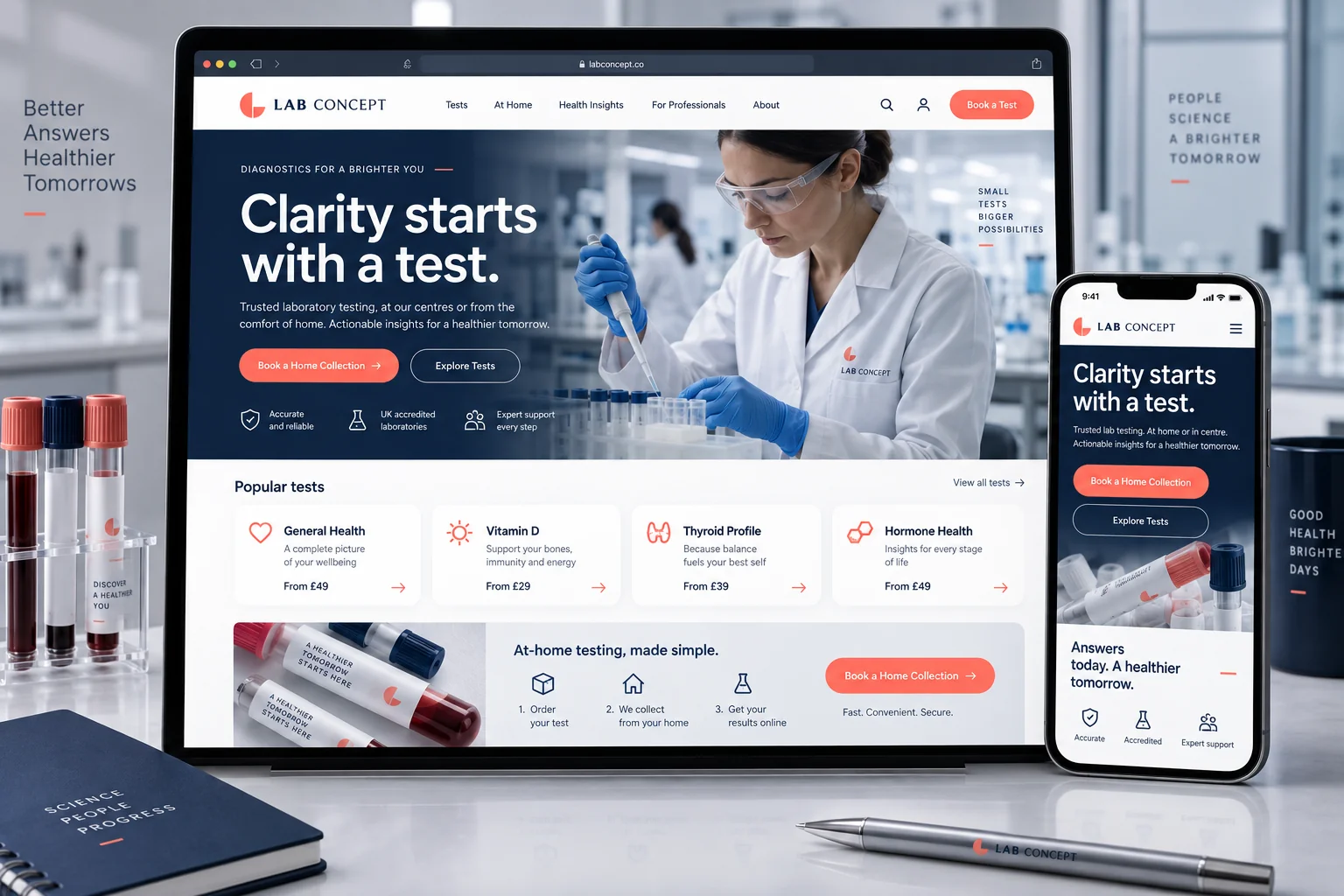
A laboratory website design with test discovery and home-collection booking across desktop and mobile.
Independent studio design by Branding Pioneers — not a commissioned client project.
Behind the work
The brief
A laboratory website design with test discovery and home-collection booking across desktop and mobile.
Design decisions
Want something like this for your practice?
Discuss a project like thisMore in this discipline
Studio designIndependent studio design · English
A pharmacy storefront design with prescription upload, pharmacist support and accessible product discovery.
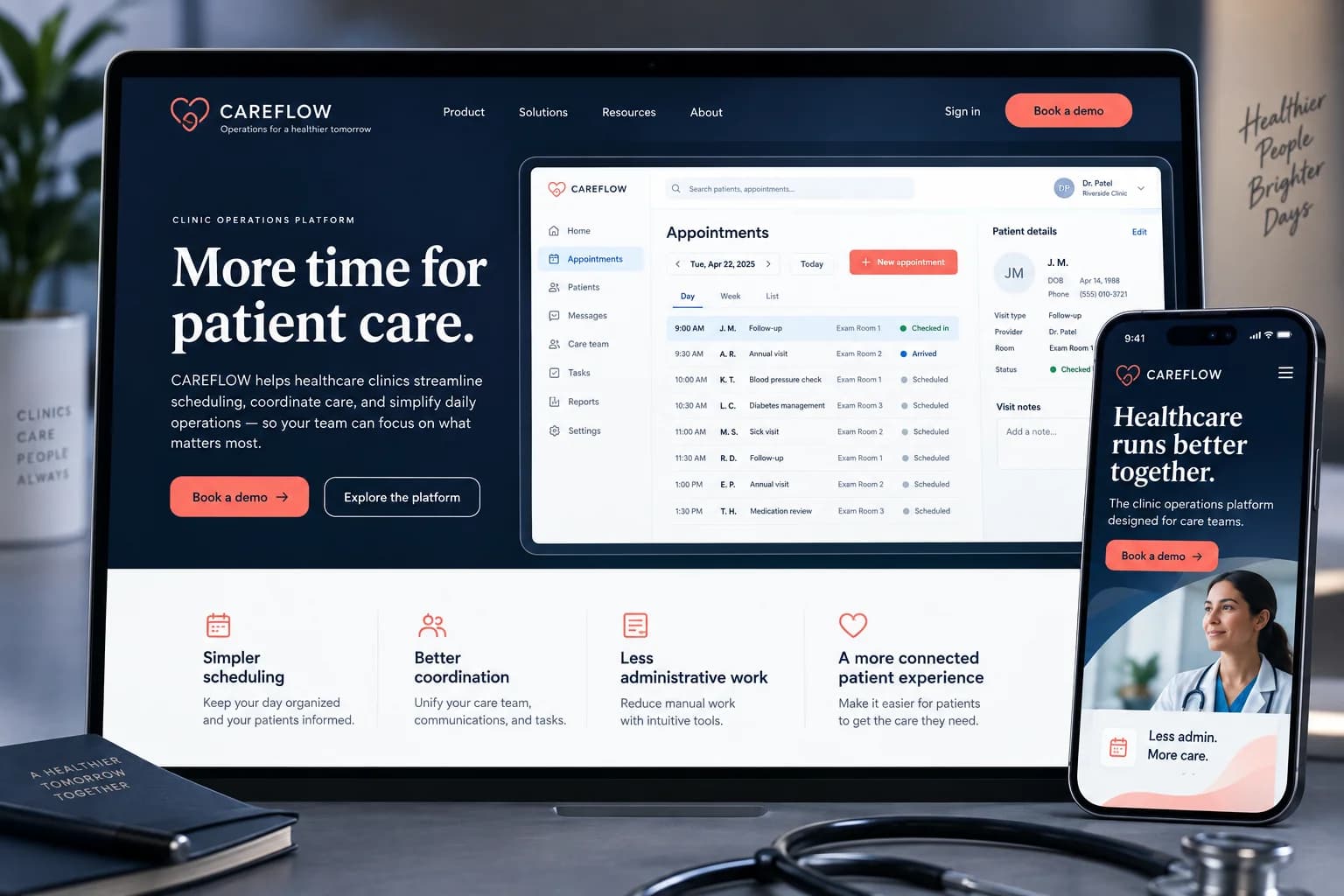 Studio design
Independent studio design · English
A health-tech website design with clinic scheduling UI, care-team coordination and a clear demonstration-booking journey.
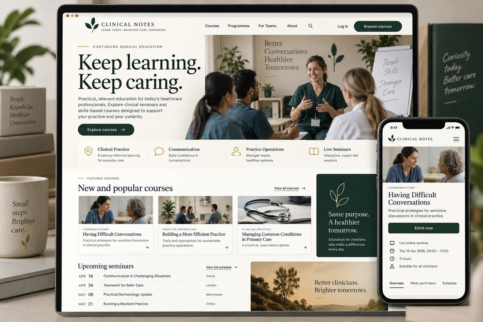 Studio design
Independent studio design · English
A continuing medical education website design with course discovery, clinician seminars and mobile programme details.
Discuss your project
Three quick questions. We come prepared with a plan for your specialty and city.

 You’ll speak with a senior strategist
Where this work goes
This piece belongs to the healthcare websites collection. On client work it becomes custom website design and online appointment scheduling, delivered through our healthcare websites work.
For the reasoning behind work like Diagnostics and home collection website, read the healthcare website design guide and what should be on a doctor website. See how a project runs from brief to delivery, or the client case studies for commissioned work.
Practical notes & supporting evidence
Design decision 1Build a consistent visual hierarchy across the collection.
Design decision 2Use a restrained navy, coral and ivory palette.
Design decision 3Let the work and its message remain readable at portfolio scale.
Diagnostics and home collection website explores this brief: A laboratory website design with test discovery and home-collection booking across desktop and mobile. The collection is labelled an independent studio design, and its published language is English. Its purpose is to explain the visual approach shown. Use that classification when citing the work, particularly when comparing concepts with commissioned client material elsewhere in the portfolio.
The recorded design decisions are: Build a consistent visual hierarchy across the collection. Use a restrained navy, coral and ivory palette. Let the work and its message remain readable at portfolio scale. Review each decision against the artwork. Look at the relative prominence of the primary message, the amount of supporting information and the way individual formats remain connected. When planning a similar assignment, identify which of these decisions meets your own brief and which needs to change for your brand, audience or service.
Start with the task a visitor needs to complete. Finding a treatment, checking a clinician’s background, identifying a location and asking for an appointment are related tasks, but they need different information. Make those paths visible in the navigation and on the relevant service pages. A good brief includes the content and the operational destination of each action: who receives the form, what happens after submission and how a visitor obtains help when the first contact route fails.
Desktop screens help explain page hierarchy, but they cannot establish the quality of the mobile experience. Check readable text, tap targets, menu behaviour and form validation on a phone. Long doctor biographies and treatment descriptions should remain easy to scan without hiding important details in decorative interactions. When a collection shows both desktop and mobile artwork, compare the priority of information across them. The mobile layout should preserve useful content rather than simply shrink the desktop composition.
A launch review should cover content ownership, approved contact information, working forms, redirects and the URLs that search engines are expected to index. If a site replaces an existing website, map important old pages to appropriate new destinations. Check titles, descriptions, canonicals and internal links against the actual released URLs. Keep the review list separate from the visual approval: a polished mockup does not prove that a live booking form, analytics event or redirect behaves correctly.
Document the difference between a design study, a delivered website and a live capture. A design study explains a proposed experience. A live capture records what the site looked like when it was captured. Neither alone establishes an improvement in appointment conversion. For an outcome comparison, use a defined period and consistent event definitions, then reconcile digital enquiries with attended appointments where the practice can do so. Performance and accessibility checks should be repeatable after future content edits, not only at the first launch.
Look first at the problem the collection addresses and the deliverables it actually contains. A website study can explain navigation and information hierarchy. A campaign collection can demonstrate how a message moves through different formats. Identity materials can show consistency across print and digital applications. These are useful design references, but each answers a different question. Choose the example closest to your intended task, then identify the parts you want to explore further rather than requesting a copy of the whole collection.
Write a brief that names your provider, audience, services, existing brand constraints and the action the work should support. Include content ownership and the practical destination of contact requests. When several stakeholders approve the work, agree who has the final decision on medical information, design and operational details. The clearer those responsibilities are, the easier it becomes to review a proposed layout without repeatedly changing the underlying service description or appointment process.
Read the collection at its intended size. Check whether the provider and message remain recognisable, whether supporting copy is legible and whether the next action is easy to understand. Look for consistent terminology across individual pieces. For multilingual work, have the wording reviewed by someone who understands the language and the service context. A translated message can change length, reading order and emphasis, so the layout needs its own review rather than an automatic text replacement.
Keep the distinction between independent studio concepts, client deliverables and editorial workflow artwork visible. Concepts explore possible design approaches. Client collections show the materials or engagement scope identified on their pages. Workflow artwork explains a process visually. None of these categories should be presented as an unverified client result. For a new project, confirm the release checklist and measurement plan separately from design approval, and make sure the source files and approval notes remain available to the team responsible for future updates.