NewNMC’s advertising guidelines for doctors are in force from 6 Oct 2026. See what to change, and get a free compliance auditNew NMC advertising rules for doctors: what to change
Independent studio design · English

Fieldwork — brand system & guidelines.

An identity that brings purposeful movement into everyday life. Explore the identity, colour palette, typography, applications and downloadable brand guidelines.

Independent studio design by Branding Pioneers — not a commissioned client project.

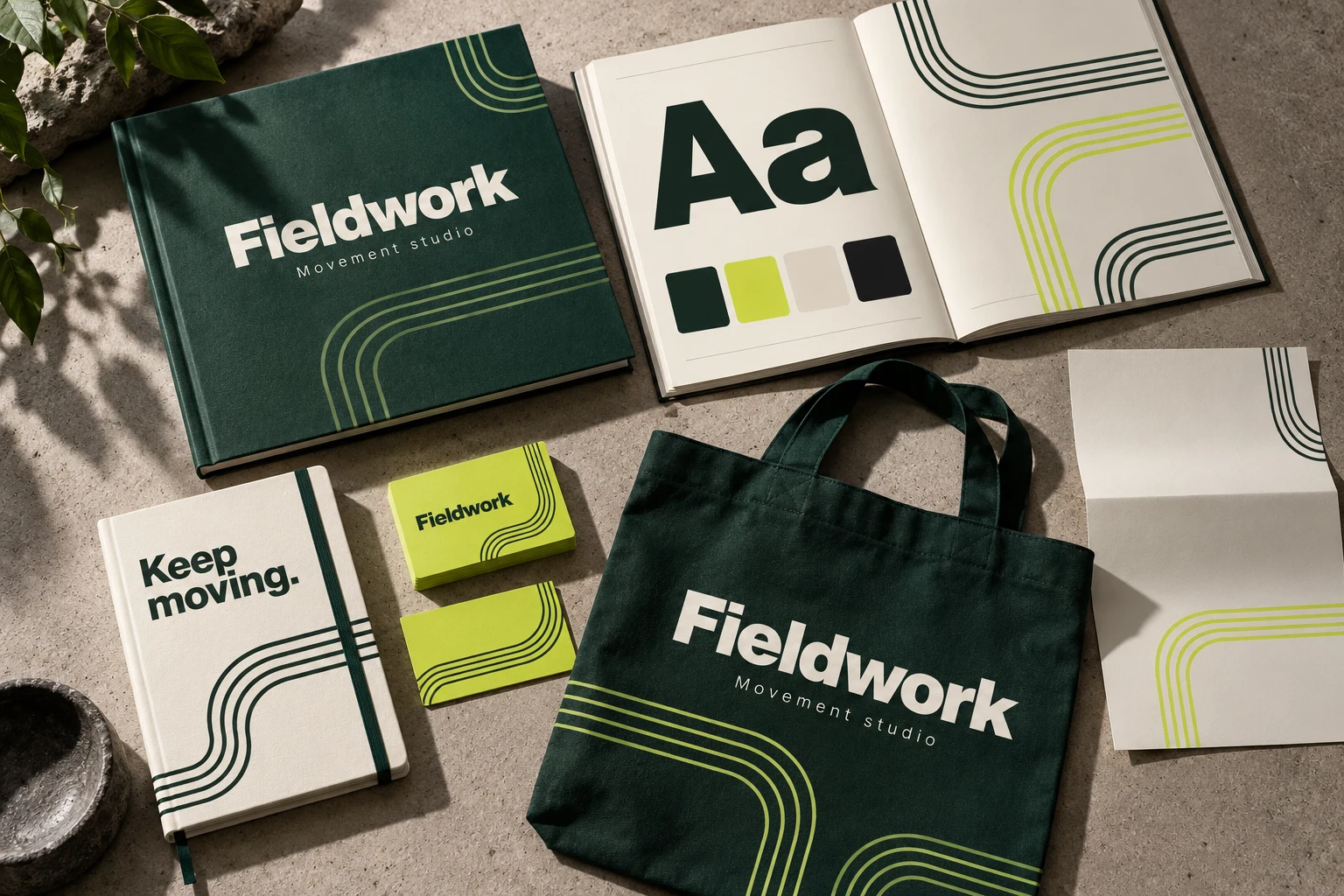
Fieldwork identity presentation with a guideline booklet, typography and colour specimens, and coordinated stationery applications.
AI-assisted application mockup. Explore the working brand guidelines below.

Brand guidelines

A system behind every application.

Explore the colour, typography, wordmark and language that keep the identity consistent. Take the six-page guideline booklet with you.

The working identity

An identity that brings purposeful movement into everyday life.

Progress feels practical. Strong type and continuous track lines make the system active without visual noise.

FieldworkMovement studio

01 / Wordmark & spacing

  • Set the wordmark in a bold sans serif, in title case, with a quiet descriptor beneath.
  • Keep one capital-F height clear around the wordmark. Minimum width: 120 px digitally or 30 mm in print.
  • Use chalk on forest or forest on chalk and chartreuse.
  • Never skew the wordmark, add speed effects or run track lines behind text.

02 / Colour system

Forest#173D35

Primary brand surface, wordmark and headlines.

Chartreuse#D6EC65

Appointment cards and selective pattern accents with forest text.

Chalk#F4F2E8

Journals, letterheads and reading surfaces.

Charcoal#202821

Body copy and functional information.

03 / Typography

Aa

Keep moving. At your pace.

Arial for display · Arial for supporting text.

One clear headline, a short introduction, then useful detail. Use sentence case and generous line spacing.

04 / Voice & expression

How the brand speaks.

  • Use short, active language that respects individual starting points.
  • Make instructions practical and leave clinical advice to the treating professional.
  • Celebrate participation without promising a fixed recovery timeline.

Four parallel tracks turn through rounded corners. Keep equal spacing and use a single colour per pattern.

05 / In use

Movement journal

A durable chalk cover, strong title and ruled interior make room for personal notes and clinician-led plans.

Appointment stationery

Chartreuse cards stand out in a bag while dark forest type keeps key details legible.

Tote & environmental graphics

Large wordmarks and continuous tracks carry the system into fabric and signage with few production colours.

An independent identity study for a fictional practice, created by Branding Pioneers. The presentation image is an AI-assisted mockup; the guideline booklet and editable wordmark define the design specifications.

Behind the work

The brief and the decisions.

The brief

What this explores

People exploring physiotherapy and rehabilitation, from everyday mobility to returning to familiar activities. Progress feels practical. Strong type and continuous track lines make the system active without visual noise.

Design decisions

From message to format

  • Four parallel tracks turn through rounded corners. Keep equal spacing and use a single colour per pattern.
  • A durable chalk cover, strong title and ruled interior make room for personal notes and clinician-led plans.
  • Chartreuse cards stand out in a bag while dark forest type keeps key details legible.
  • Large wordmarks and continuous tracks carry the system into fabric and signage with few production colours.

Want something like this for your practice?

Discuss a project like this

More in this discipline

All brand identity & print →
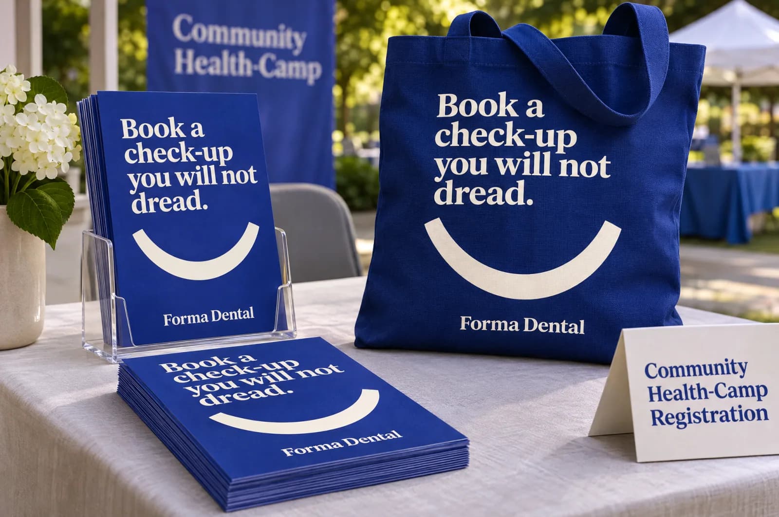
Campaign concept for the fictional brand Forma Dental, shown as printed leaflets and a tote bag at a health camp, with the headline “Book a check-up you will not dread.”.Studio design

Independent studio design · English

Forma Dental campaign — health camp leaflet

A concept for printed leaflets and a tote bag at a health camp in a campaign for Forma Dental, a fictional dental studio: “Book a check-up you will not dread.”
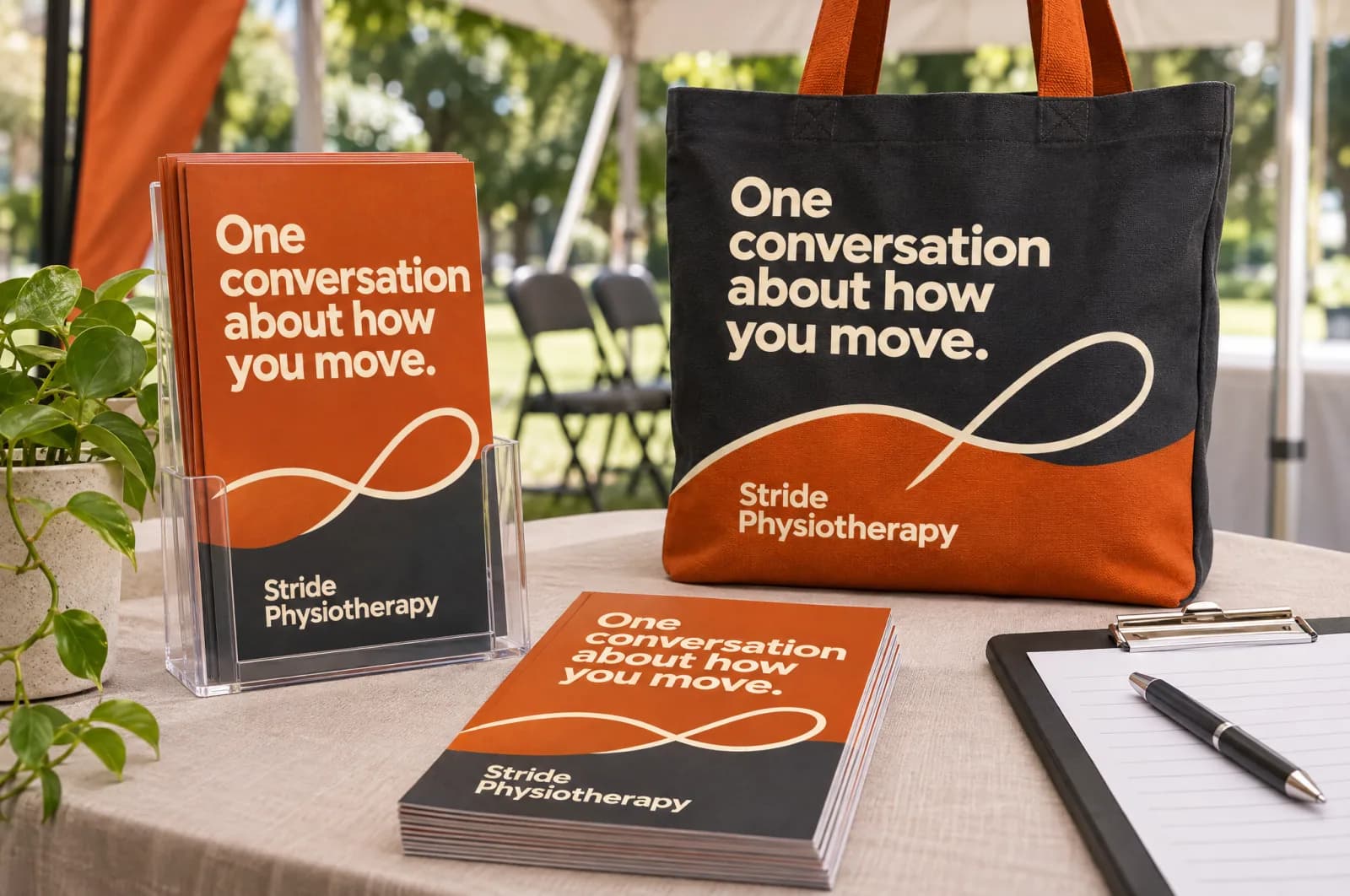
Campaign concept for the fictional brand Stride Physiotherapy, shown as printed leaflets and a tote bag at a health camp, with the headline “One conversation about how you move.”.Studio design

Independent studio design · English

Stride Physiotherapy campaign — health camp leaflet

A concept for printed leaflets and a tote bag at a health camp in a campaign for Stride Physiotherapy, a fictional physiotherapy practice: “One conversation about how you move.”

Discuss your project

Let’s build yours next.

Three quick questions. We come prepared with a plan for your specialty and city.

  • A 30-minute call with a healthcare specialist
  • Your top three growth opportunities, in writing
  • Honest advice — even if that means not hiring us
  • No obligation and no hard sell
You’ll speak with a senior strategist
Consultations are hosted by Arush Thapar’s team.
Step 1 of 3Takes 30 seconds

What do you want to improve first?

Details stay privateNo obligationReply within 1 working day