NewNMC’s advertising guidelines for doctors are in force from 6 Oct 2026. See what to change, and get a free compliance auditNew NMC advertising rules for doctors: what to change
Independent studio design · English

Serein — brand system & guidelines.

A quieter first step into a conversation about wellbeing. Explore the identity, colour palette, typography, applications and downloadable brand guidelines.

Independent studio design by Branding Pioneers — not a commissioned client project.

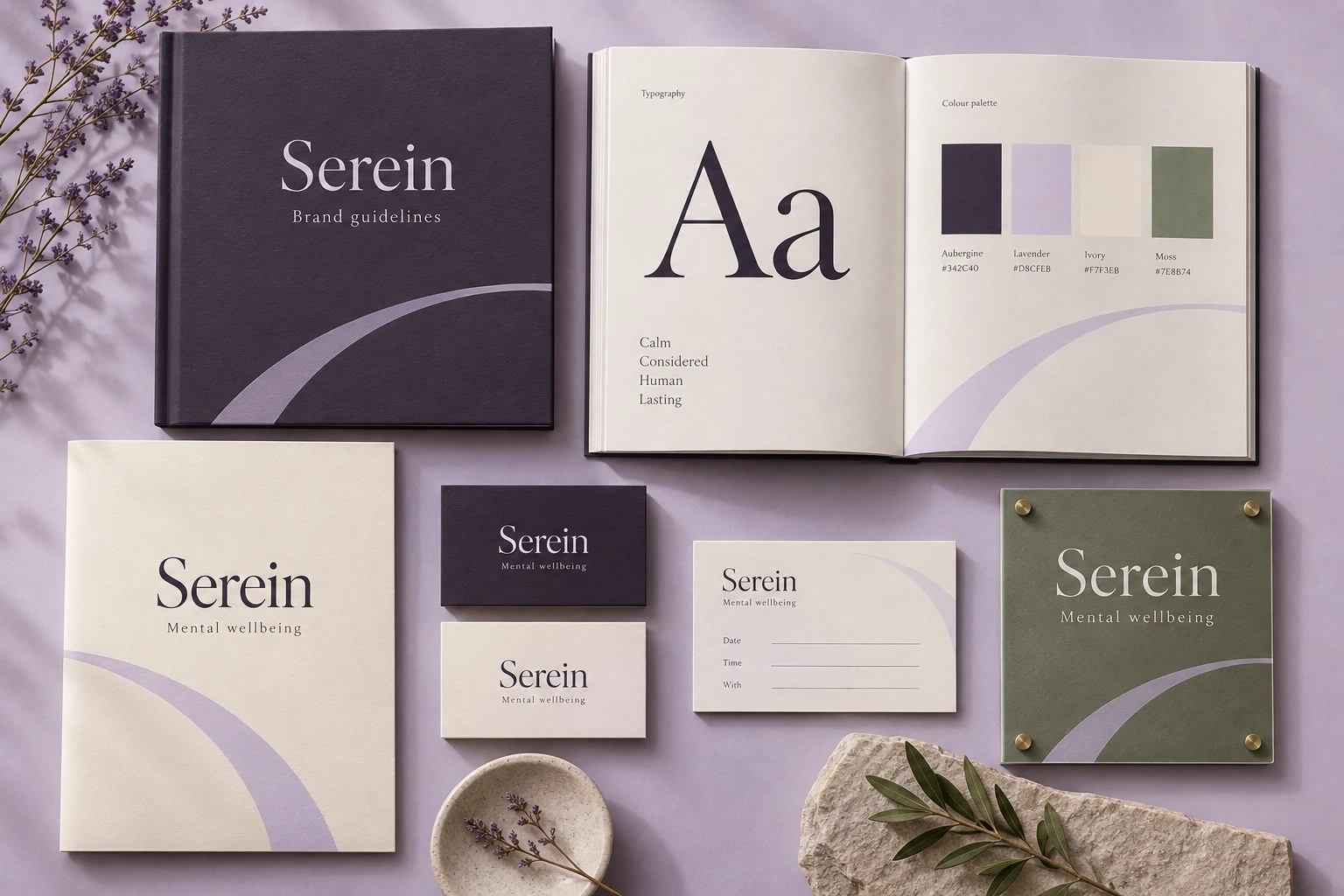
Serein identity presentation with a guideline booklet, typography and colour specimens, and coordinated stationery applications.
AI-assisted application mockup. Explore the working brand guidelines below.

Brand guidelines

A system behind every application.

Explore the colour, typography, wordmark and language that keep the identity consistent. Take the six-page guideline booklet with you.

The working identity

A quieter first step into a conversation about wellbeing.

Make space for the person. Calm hierarchy, gentle pacing and thoughtful language are the core of the identity.

SereinMental wellbeing

01 / Wordmark & spacing

  • Use the serif wordmark in title case, with the descriptor on a separate line.
  • Keep one capital-S height clear around the wordmark. Minimum width: 100 px digitally or 25 mm in print.
  • Use aubergine on ivory or lavender; use ivory on aubergine.
  • Do not condense the letters, set the wordmark in all caps or add clinical symbols.

02 / Colour system

Aubergine#342C40

Primary wordmark, headings and body text.

Lavender#D8CFEB

Quiet backgrounds and the open-arch motif.

Ivory#F7F3EB

Welcome packs, reading surfaces and stationery.

Moss#7E8B74

Environmental accents; avoid small white text on this colour.

03 / Typography

Aa

A little space. A first conversation.

Georgia for display · Arial for supporting text.

One clear headline, a short introduction, then useful detail. Use sentence case and generous line spacing.

04 / Voice & expression

How the brand speaks.

  • Invite rather than instruct: “Let’s start with a conversation.”
  • Explain what happens next without pressure or urgency.
  • Avoid diagnostic labels in marketing copy and promises of recovery.

One open arch creates a sense of space. Crop it at the edge of a cover; never place it over body copy.

05 / In use

Welcome folder

A generous ivory cover and one arch introduce the practice. Inside pages prioritise the appointment process and contact choices.

Appointment cards

A clear date, time and practitioner area supports practical use; the identity stays secondary to the appointment details.

Wayfinding

Use short, respectful labels with clear contrast. Give directions enough room to be read at a distance.

An independent identity study for a fictional practice, created by Branding Pioneers. The presentation image is an AI-assisted mockup; the guideline booklet and editable wordmark define the design specifications.

Behind the work

The brief and the decisions.

The brief

What this explores

People exploring a first consultation who need clear information, privacy and a welcoming tone. Make space for the person. Calm hierarchy, gentle pacing and thoughtful language are the core of the identity.

Design decisions

From message to format

  • One open arch creates a sense of space. Crop it at the edge of a cover; never place it over body copy.
  • A generous ivory cover and one arch introduce the practice. Inside pages prioritise the appointment process and contact choices.
  • A clear date, time and practitioner area supports practical use; the identity stays secondary to the appointment details.
  • Use short, respectful labels with clear contrast. Give directions enough room to be read at a distance.

Want something like this for your practice?

Discuss a project like this

More in this discipline

All brand identity & print →
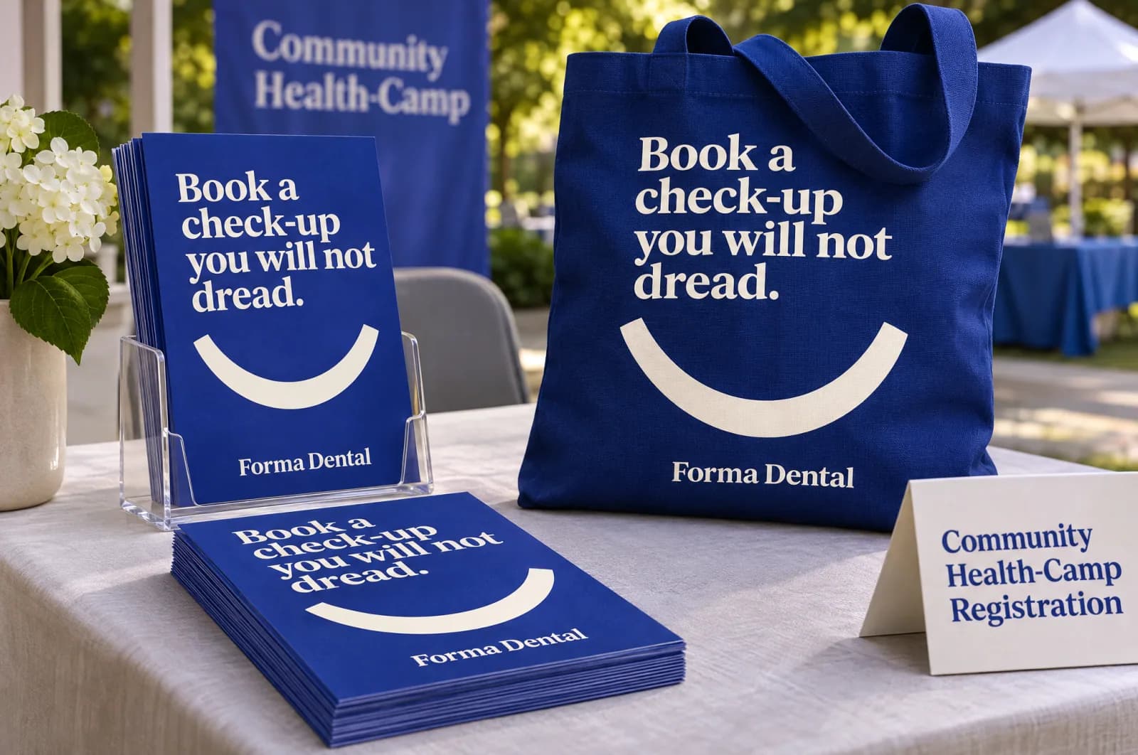
Campaign concept for the fictional brand Forma Dental, shown as printed leaflets and a tote bag at a health camp, with the headline “Book a check-up you will not dread.”.Studio design

Independent studio design · English

Forma Dental campaign — health camp leaflet

A concept for printed leaflets and a tote bag at a health camp in a campaign for Forma Dental, a fictional dental studio: “Book a check-up you will not dread.”
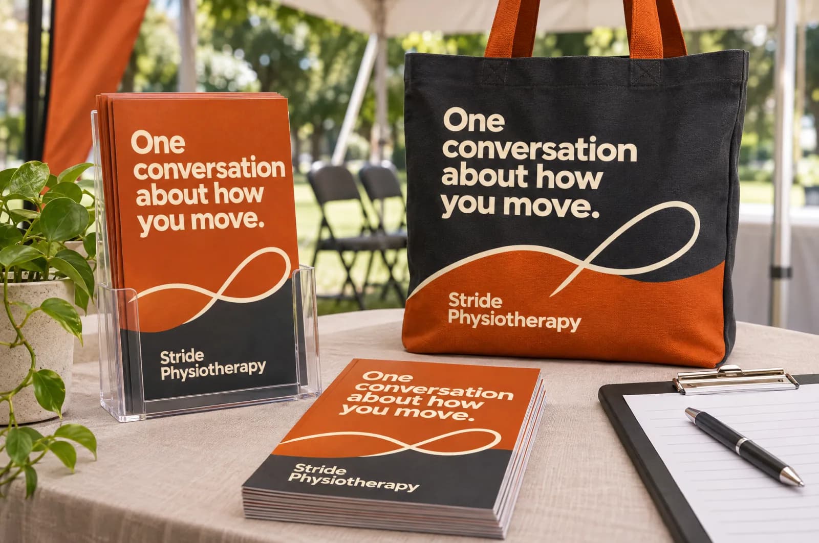
Campaign concept for the fictional brand Stride Physiotherapy, shown as printed leaflets and a tote bag at a health camp, with the headline “One conversation about how you move.”.Studio design

Independent studio design · English

Stride Physiotherapy campaign — health camp leaflet

A concept for printed leaflets and a tote bag at a health camp in a campaign for Stride Physiotherapy, a fictional physiotherapy practice: “One conversation about how you move.”

Discuss your project

Let’s build yours next.

Three quick questions. We come prepared with a plan for your specialty and city.

  • A 30-minute call with a healthcare specialist
  • Your top three growth opportunities, in writing
  • Honest advice — even if that means not hiring us
  • No obligation and no hard sell
You’ll speak with a senior strategist
Consultations are hosted by Arush Thapar’s team.
Step 1 of 3Takes 30 seconds

What do you want to improve first?

Details stay privateNo obligationReply within 1 working day