NewNMC’s advertising guidelines for doctors are in force from 6 Oct 2026. See what to change, and get a free compliance auditNew NMC advertising rules for doctors: what to change
Independent studio design · English

Stillwater — brand system & guidelines.

A familiar, dignified identity for care that comes home. Explore the identity, colour palette, typography, applications and downloadable brand guidelines.
Independent studio design by Branding Pioneers — not a commissioned client project.

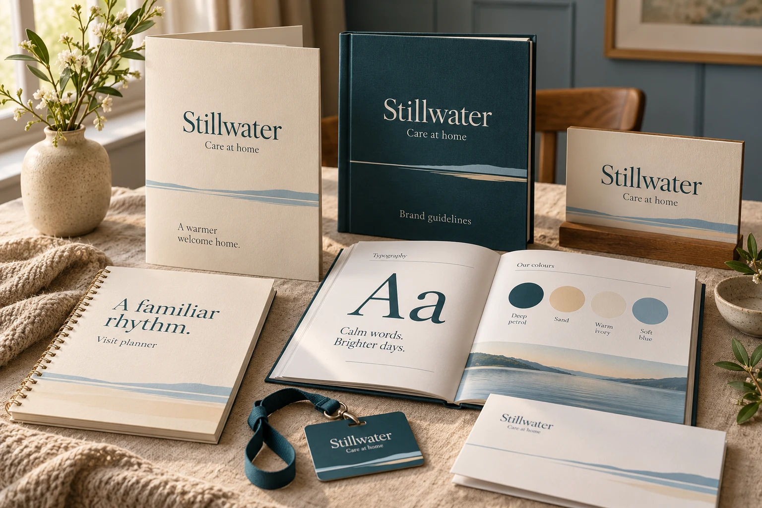
Stillwater identity presentation with a guideline booklet, typography and colour specimens, and coordinated stationery applications.
AI-assisted application mockup. Explore the working brand guidelines below.

Brand guidelines

A system behind every application.

Explore the colour, typography, wordmark and language that keep the identity consistent. Take the six-page guideline booklet with you.

The working identity

A familiar, dignified identity for care that comes home.

Respect the individual. Calm typography, legible practical information and a consistent visual rhythm guide every touchpoint.

StillwaterCare at home

01 / Wordmark & spacing

  • Keep the serif wordmark in title case; place the care descriptor on its own line.
  • Reserve one capital-S height of clear space. Minimum width: 140 px digitally or 35 mm in print.
  • Use petrol on ivory or sand, and ivory on petrol. Keep light accent colours out of small text.
  • Do not compress the wordmark or sacrifice readability to decorative effects.

02 / Colour system

Petrol#23464C

Wordmarks, headlines and functional text.

Sand#E5D5B9

Folders, cover panels and quiet background areas.

Ivory#FAF7F0

Letters and large-print reading surfaces.

Soft blue#A7C7CE

Horizon details and supporting environmental accents.

03 / Typography

Aa

A familiar rhythm. Room for you.

Georgia for display · Arial for supporting text.

One clear headline, a short introduction, then useful detail. Use sentence case and generous line spacing.

04 / Voice & expression

How the brand speaks.

  • Speak directly to the person receiving care, with respect and clarity.
  • Use familiar language to explain visits, choices and contact options.
  • Avoid infantilising expressions, urgency tactics or promises of independence or recovery.

A fine horizon rule and a soft blue band anchor the lower edge of stationery. Leave generous space above for useful information.

05 / In use

Family welcome folder

A simple document sequence explains the service and points families towards the right contact, with ample room for clear headings.

Visit planner

Use large type, generous writing spaces and clearly separated dates; offer an accessible format suited to the reader.

Care-team identification

A consistent header and strong contrast make approved staff details easy to locate; keep decorative bands away from key information.

An independent identity study for a fictional practice, created by Branding Pioneers. The presentation image is an AI-assisted mockup; the guideline booklet and editable wordmark define the design specifications.

Behind the work

The brief and the decisions.

The brief

What this explores

Older adults and family members comparing home-care support and coordinating day-to-day visits. Respect the individual. Calm typography, legible practical information and a consistent visual rhythm guide every touchpoint.

Design decisions

From message to format

  • A fine horizon rule and a soft blue band anchor the lower edge of stationery. Leave generous space above for useful information.
  • A simple document sequence explains the service and points families towards the right contact, with ample room for clear headings.
  • Use large type, generous writing spaces and clearly separated dates; offer an accessible format suited to the reader.
  • A consistent header and strong contrast make approved staff details easy to locate; keep decorative bands away from key information.

Want something like this for your practice?

Discuss a project like this

More in this discipline

All brand identity & print →
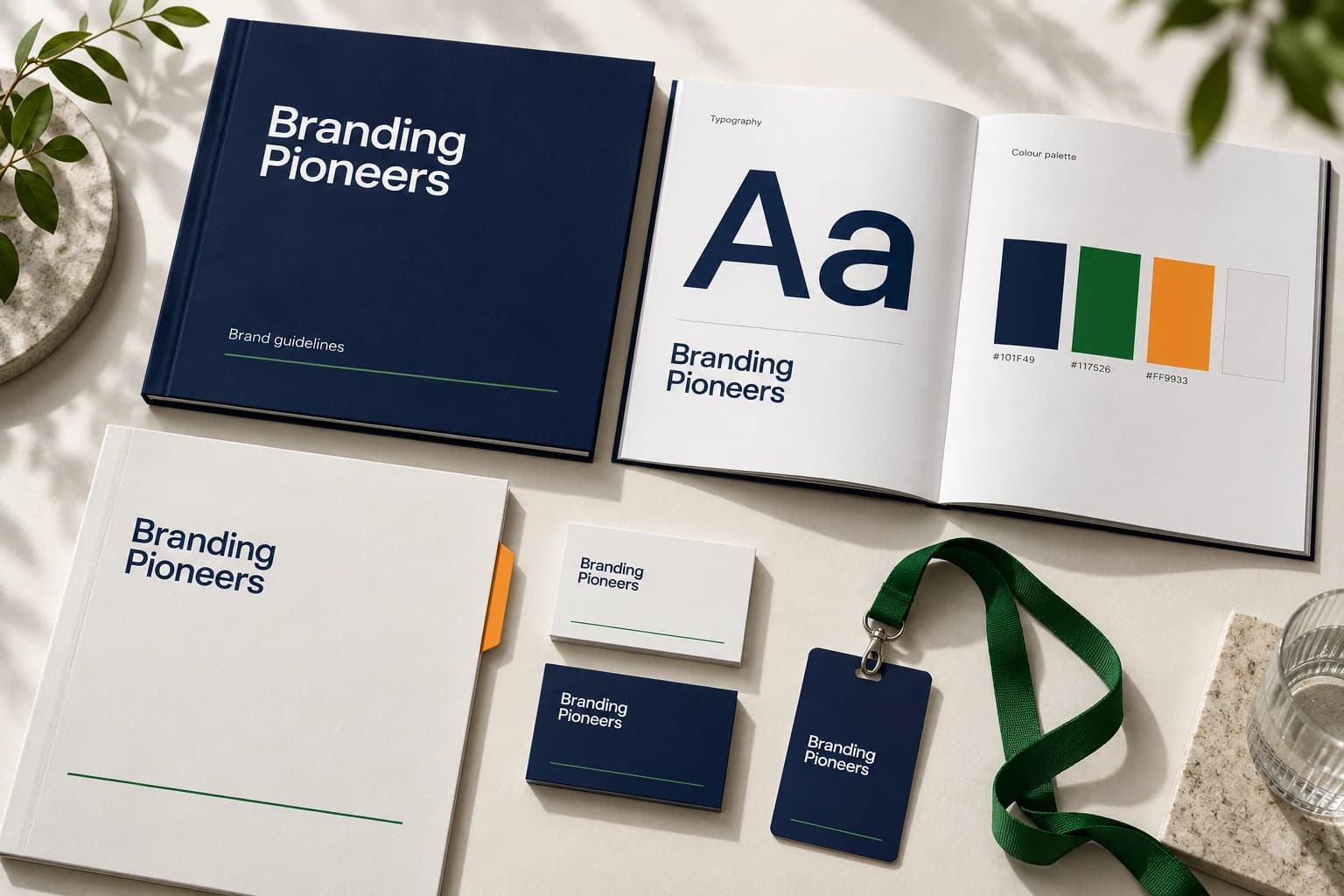
Branding Pioneers identity presentation with a guideline booklet, typography and colour specimens, and coordinated stationery applications.Internal brand

Our studio brand · English

Branding Pioneers — brand system & guidelines

Make healthcare brands easier to recognise, understand and choose. Explore the identity, colour palette, typography, applications and downloadable brand guidelines.

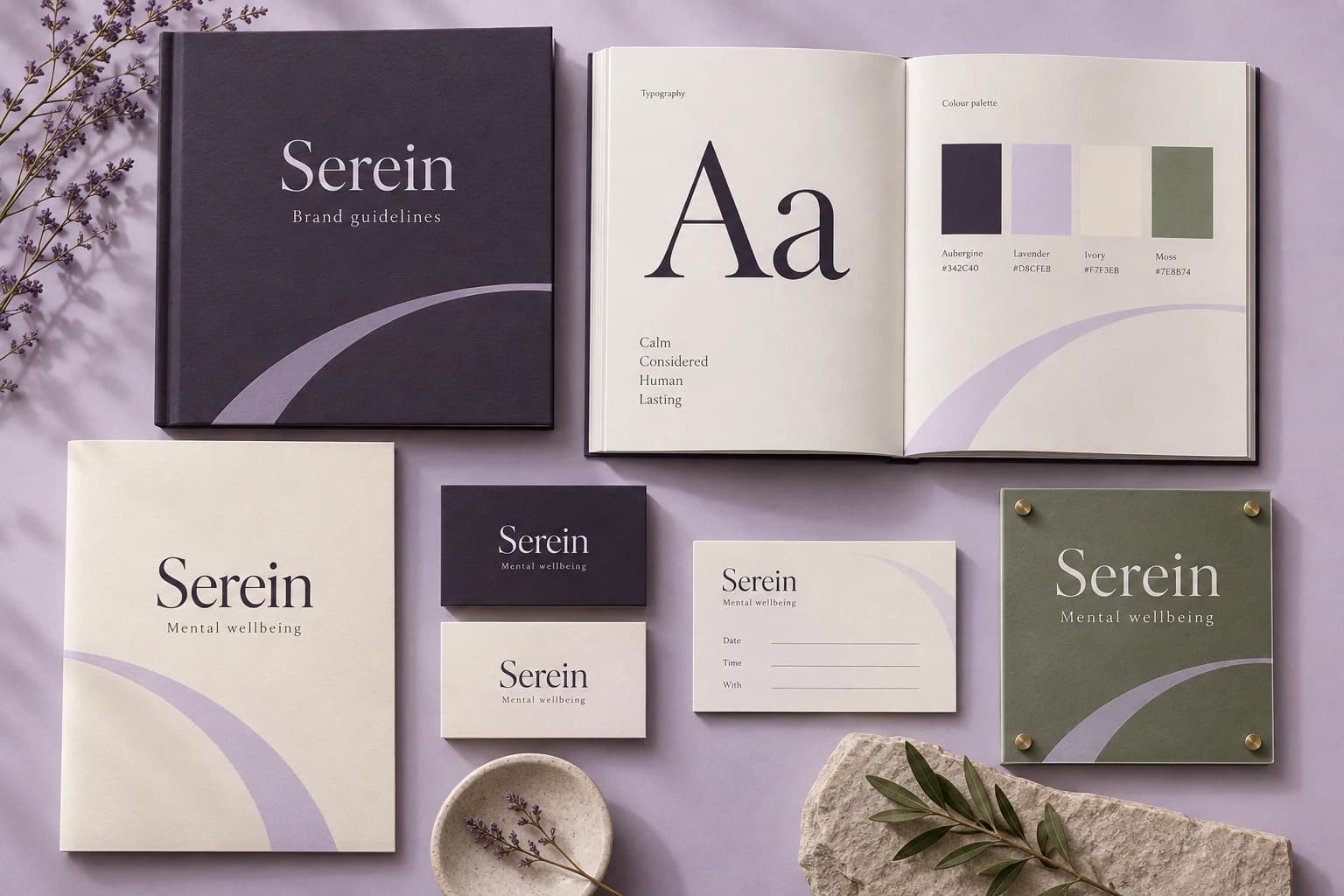
Serein identity presentation with a guideline booklet, typography and colour specimens, and coordinated stationery applications.Studio design

Independent studio design · English

Serein — brand system & guidelines

A quieter first step into a conversation about wellbeing. Explore the identity, colour palette, typography, applications and downloadable brand guidelines.

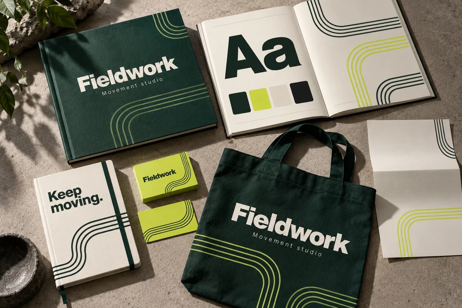
Fieldwork identity presentation with a guideline booklet, typography and colour specimens, and coordinated stationery applications.Studio design

Independent studio design · English

Fieldwork — brand system & guidelines

An identity that brings purposeful movement into everyday life. Explore the identity, colour palette, typography, applications and downloadable brand guidelines.

Discuss your project

Let’s build yours next.

Three quick questions. We come prepared with a plan for your specialty and city.

  • A 30-minute call with a healthcare specialist
  • Your top three growth opportunities, in writing
  • Honest advice — even if that means not hiring us
  • No obligation and no hard sell
You’ll speak with a senior strategist
Consultations are hosted by Arush Thapar’s team.
Step 1 of 3Takes 30 seconds

What do you want to improve first?

Details stay privateNo obligationReply within 1 working day