
 Client work
Doctor-led video & patient education
Medanta Hospitals
A collection of specialist-led video content and healthcare campaign creative, bringing medical expertise into recognisable branded formats.
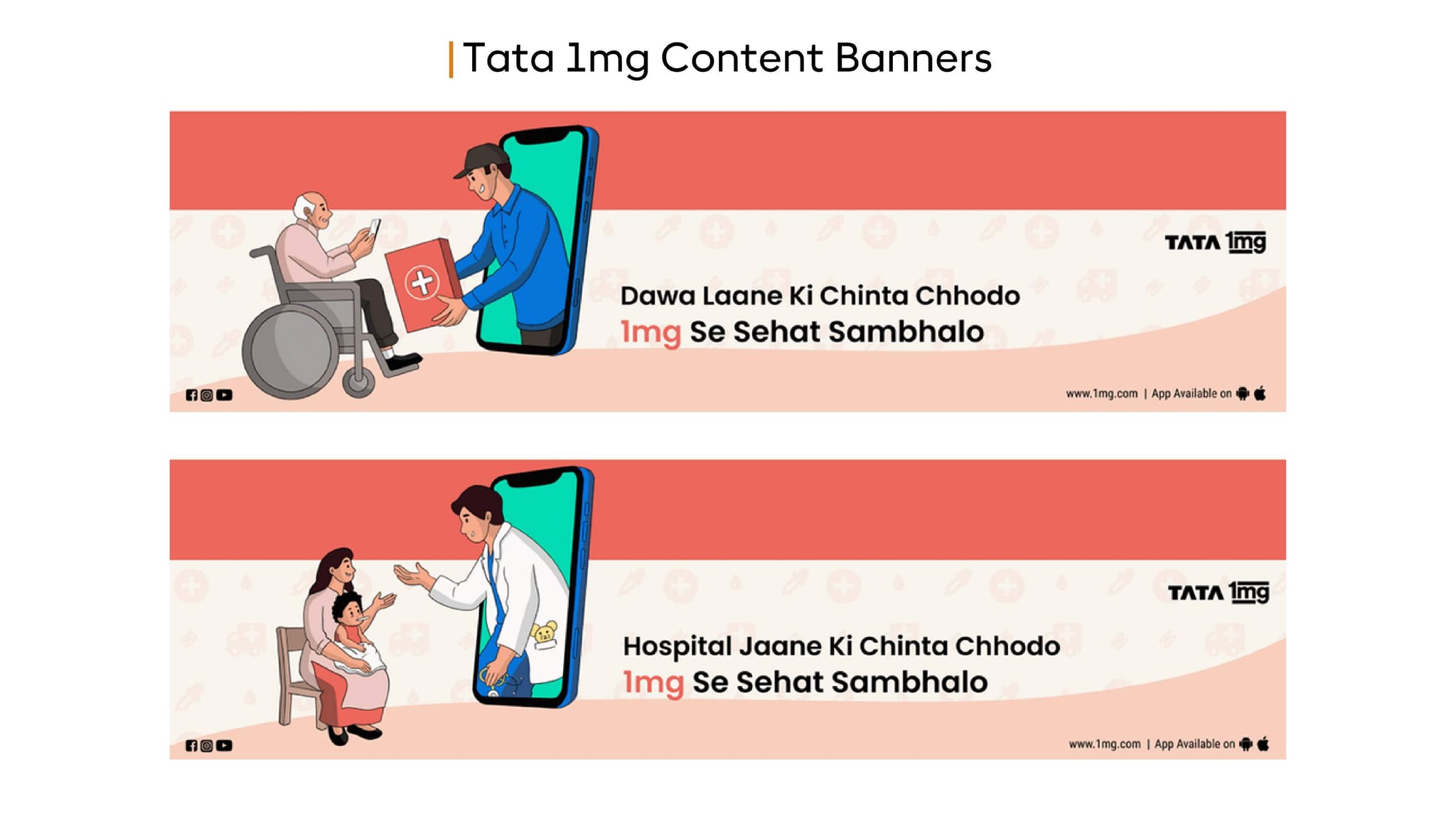
Illustrated content banners connecting medicine delivery and online consultation with a consistent Tata 1mg campaign message.
Scope
A note on this collection
The collection documents the banner creative shown. Campaign dates, spend and conversion results are not supplied with this portfolio sheet.
Want work like this for your hospital or clinic?
Discuss your projectClient portfolio
Client workDoctor-led video & patient education
A collection of specialist-led video content and healthcare campaign creative, bringing medical expertise into recognisable branded formats.
 Client work
Brand identity & healthcare campaigns
Identity guidelines, social applications and kidney-care awareness creative from the Aster portfolio, with its distinctive green and navy visual language.
Fertility specialist brand & content
A doctor-brand programme combining fertility education, search, paid media and social content across the patient decision journey.
Discuss your project
Three quick questions. We come prepared with a plan for your specialty and city.

 You’ll speak with a senior strategist
Health platforms like this
Digital health brands need reach and trust at the same time. That means social media strategy, educational health content and performance ads that respect advertising rules for health products.
Our telehealth and pharmacy and retail pages cover the approach, the healthcare startups page covers growth-stage brands, and the social media portfolio shows more creative of this kind.
Practical notes & supporting evidence
Start hereTata 1mg
Establish contextUse the published scope and relevant source material
Choose the next stepFollow the linked resource and assign an owner
Illustrated content banners connecting medicine delivery and online consultation with a consistent Tata 1mg campaign message. The published discipline is Digital content banners. The collection covers Content banner design; Illustrated campaign storytelling; Hindi messaging in Roman script. Read that scope together with the original asset captions to understand which parts of the programme can be inspected here. The collection documents the banner creative shown. Campaign dates, spend and conversion results are not supplied with this portfolio sheet.
The public collection contains 1 image item: Tata 1mg · Original content-banner portfolio sheet.. Open each image at full size before reviewing the design. Keep mixed-client sheets labelled as mixed-client material, and distinguish an identity application from a report of campaign performance.
Start with the task a visitor needs to complete. Finding a treatment, checking a clinician’s background, identifying a location and asking for an appointment are related tasks, but they need different information. Make those paths visible in the navigation and on the relevant service pages. A good brief includes the content and the operational destination of each action: who receives the form, what happens after submission and how a visitor obtains help when the first contact route fails.
Desktop screens help explain page hierarchy, but they cannot establish the quality of the mobile experience. Check readable text, tap targets, menu behaviour and form validation on a phone. Long doctor biographies and treatment descriptions should remain easy to scan without hiding important details in decorative interactions. When a collection shows both desktop and mobile artwork, compare the priority of information across them. The mobile layout should preserve useful content rather than simply shrink the desktop composition.
A launch review should cover content ownership, approved contact information, working forms, redirects and the URLs that search engines are expected to index. If a site replaces an existing website, map important old pages to appropriate new destinations. Check titles, descriptions, canonicals and internal links against the actual released URLs. Keep the review list separate from the visual approval: a polished mockup does not prove that a live booking form, analytics event or redirect behaves correctly.
Document the difference between a design study, a delivered website and a live capture. A design study explains a proposed experience. A live capture records what the site looked like when it was captured. Neither alone establishes an improvement in appointment conversion. For an outcome comparison, use a defined period and consistent event definitions, then reconcile digital enquiries with attended appointments where the practice can do so. Performance and accessibility checks should be repeatable after future content edits, not only at the first launch.
Look first at the problem the collection addresses and the deliverables it actually contains. A website study can explain navigation and information hierarchy. A campaign collection can demonstrate how a message moves through different formats. Identity materials can show consistency across print and digital applications. These are useful design references, but each answers a different question. Choose the example closest to your intended task, then identify the parts you want to explore further rather than requesting a copy of the whole collection.
Write a brief that names your provider, audience, services, existing brand constraints and the action the work should support. Include content ownership and the practical destination of contact requests. When several stakeholders approve the work, agree who has the final decision on medical information, design and operational details. The clearer those responsibilities are, the easier it becomes to review a proposed layout without repeatedly changing the underlying service description or appointment process.
Read the collection at its intended size. Check whether the provider and message remain recognisable, whether supporting copy is legible and whether the next action is easy to understand. Look for consistent terminology across individual pieces. For multilingual work, have the wording reviewed by someone who understands the language and the service context. A translated message can change length, reading order and emphasis, so the layout needs its own review rather than an automatic text replacement.
Keep the distinction between independent studio concepts, client deliverables and editorial workflow artwork visible. Concepts explore possible design approaches. Client collections show the materials or engagement scope identified on their pages. Workflow artwork explains a process visually. None of these categories should be presented as an unverified client result. For a new project, confirm the release checklist and measurement plan separately from design approval, and make sure the source files and approval notes remain available to the team responsible for future updates.
Begin with the question you need to answer, then choose the most appropriate destination in this collection. A guide explains a method, a checklist supports a repeatable review, a calculator explores assumptions and a case file documents a particular engagement. Reading them as interchangeable resources can create confusion. If you need to brief a supplier, start with the relevant service or framework. If you need to assess evidence, start with the source reports and the limits stated alongside the example.
Use the collection to narrow the investigation rather than adding every possible task to a marketing plan. Identify the stage where progress is blocked: discovery, understanding the service, making contact, arranging an appointment or following up. Choose a resource that addresses that stage and keep a short note of the evidence you need. A focused review is easier to act on than a long list of unrelated recommendations, particularly when clinical approvals and operational changes involve different people.