Make healthcare brands easier to recognise, understand and choose. Explore the identity, colour palette, typography, applications and downloadable brand guidelines.
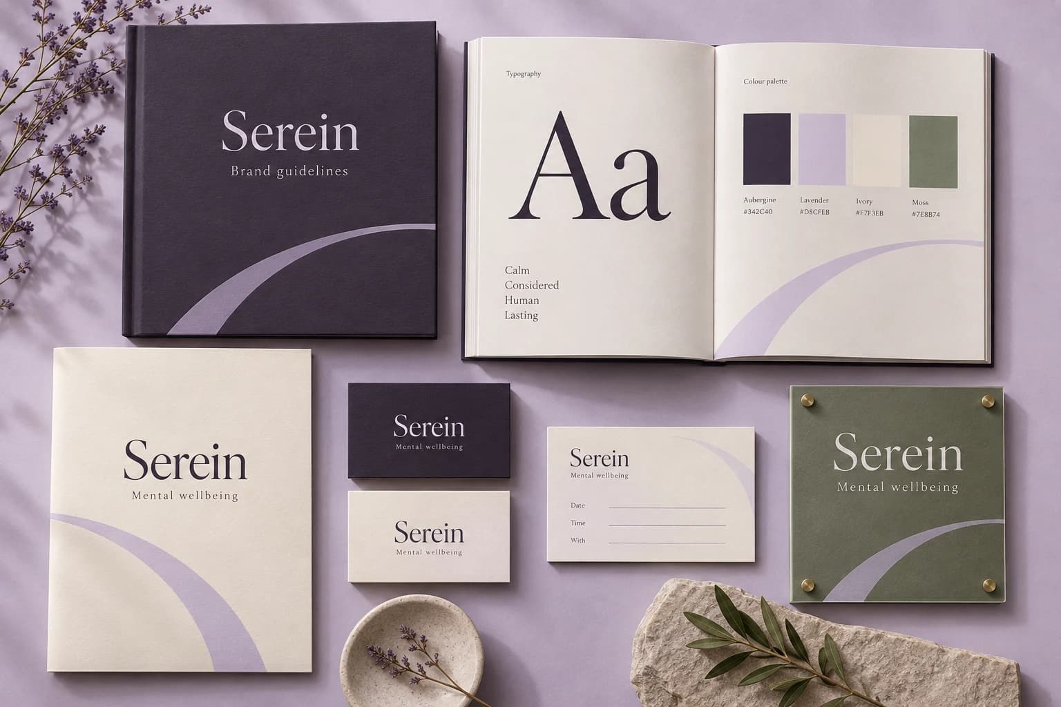
A quieter first step into a conversation about wellbeing. Explore the identity, colour palette, typography, applications and downloadable brand guidelines.
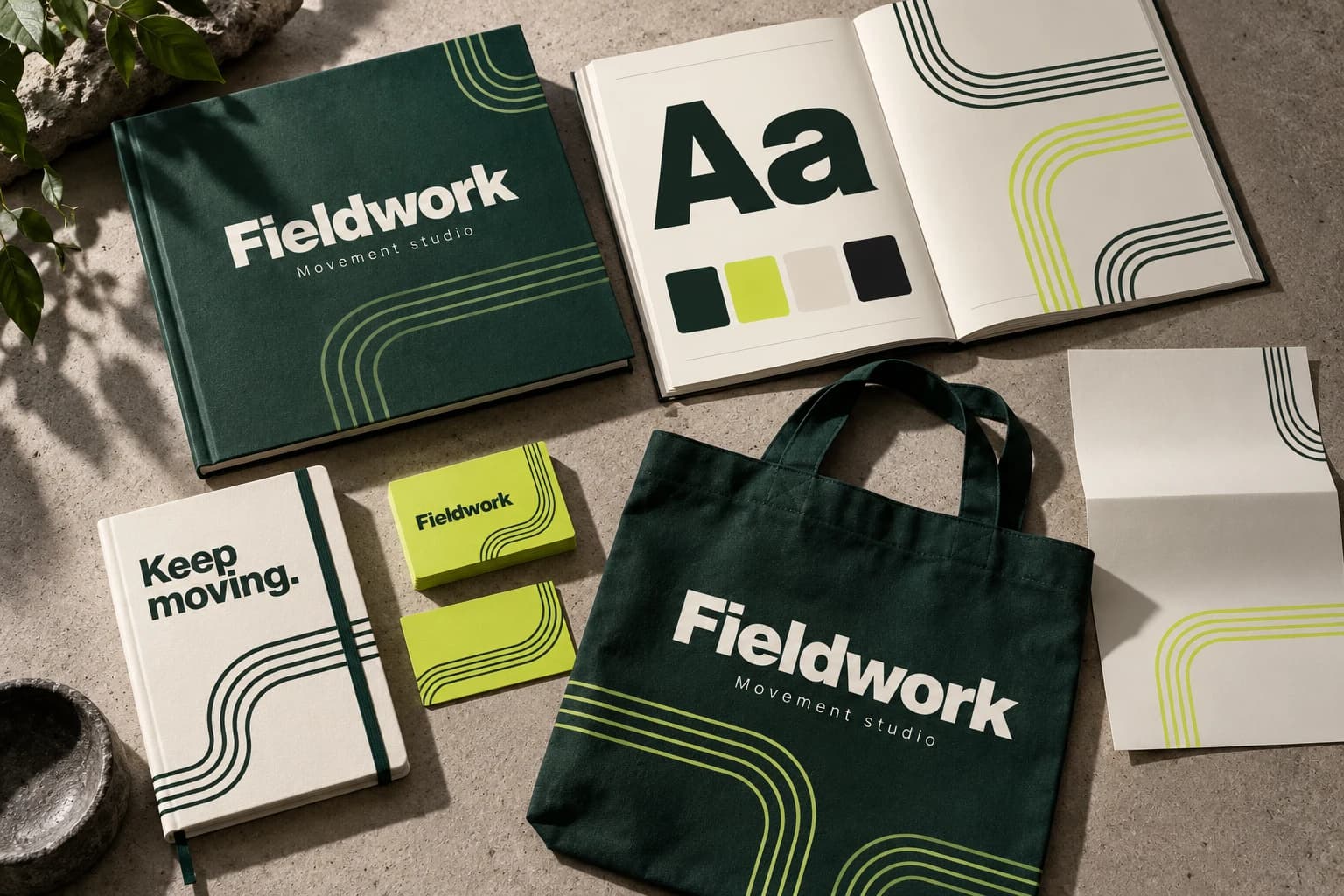
An identity that brings purposeful movement into everyday life. Explore the identity, colour palette, typography, applications and downloadable brand guidelines.
Discuss your project
Let’s build yours next.
Three quick questions. We come prepared with a plan for your specialty and city.
A 30-minute call with a healthcare specialist
Your top three growth opportunities, in writing
Honest advice — even if that means not hiring us
No obligation and no hard sell
You’ll speak with a senior strategist Consultations are hosted by Arush Thapar’s team.
Step 1 of 3Takes 30 seconds
What do you want to improve first?
Details stay privateNo obligationReply within 1 working day
Published by Branding Pioneers · Project brief and published design decisions
A practical reference for this page
01
Design decision 1Establish one primary message and a clear reading order.
02
Design decision 2Balance healthcare imagery with legible typography.
03
Design decision 3Adapt the composition to the intended campaign or print format.
The project brief in context
Hospital outdoor campaign explores this brief: Create an original hospital outdoor campaign that carries a clear healthcare message through its visual hierarchy and format. The collection is labelled an independent studio design, and its published language is English. Its purpose is to explain the visual approach shown. Use that classification when citing the work, particularly when comparing concepts with commissioned client material elsewhere in the portfolio.
The recorded design decisions are: Establish one primary message and a clear reading order. Balance healthcare imagery with legible typography. Adapt the composition to the intended campaign or print format. Review each decision against the artwork. Look at the relative prominence of the primary message, the amount of supporting information and the way individual formats remain connected. When planning a similar assignment, identify which of these decisions meets your own brief and which needs to change for your brand, audience or service.
A hospital programme needs department and location ownership
Multi-specialty providers need a consistent brand while preserving accurate department, clinician and location information. Map the enquiry to the department capable of answering it and identify who maintains those details. A central publishing system is useful only when local service changes can be reflected reliably. For an initial review, test the journey for a small number of high-priority departments before treating the homepage as representative of the whole hospital experience.
An identity needs to work at the point of care
Healthcare identity design extends beyond the logo. Patients encounter appointment reminders, reception signage, folders, forms, brochures and digital pages during the same relationship with a provider. A coherent system makes those materials recognisable and easier to navigate. Review the hierarchy of the provider name, service information, contact details and any instructions a patient needs. Consistent colours and type treatments help the materials belong together, but clarity should determine the layout of practical information.
Inspect identity applications at the size and in the environment where they will be used. A brochure spread has different constraints from a mobile post or a sign viewed at a distance. Include long doctor names, multilingual text and location details in the review rather than only short demonstration labels. Where a portfolio shows stationery or print artwork, treat it as evidence of the visual application shown. Printing specifications, campaign dates and operational use need separate documentation if they are part of a new project brief.
Define the boundaries before adapting the collection
A useful brand brief states which elements already exist, which can change and who approves the result. A new clinic identity, an extension of an established hospital brand and a campaign within an existing identity are different assignments. Collect the current logo files, approved colour values, terminology and examples of existing materials. That makes it possible to distinguish a deliberate design decision from an accidental inconsistency when the work moves across teams and suppliers.
Review patient-facing copy alongside the artwork. Claims, clinician titles, contact details and translations need approval from the people responsible for them. Keep editable source files and a short set of application rules so later materials can follow the same system. The value of the portfolio is in understanding the relationship between message and format. It does not establish a future client’s recognition level or business results, and visual similarity alone is not a reason to copy another provider’s positioning.
Use the portfolio as a project brief
Look first at the problem the collection addresses and the deliverables it actually contains. A website study can explain navigation and information hierarchy. A campaign collection can demonstrate how a message moves through different formats. Identity materials can show consistency across print and digital applications. These are useful design references, but each answers a different question. Choose the example closest to your intended task, then identify the parts you want to explore further rather than requesting a copy of the whole collection.
Write a brief that names your provider, audience, services, existing brand constraints and the action the work should support. Include content ownership and the practical destination of contact requests. When several stakeholders approve the work, agree who has the final decision on medical information, design and operational details. The clearer those responsibilities are, the easier it becomes to review a proposed layout without repeatedly changing the underlying service description or appointment process.
What to check when reviewing the artwork
Read the collection at its intended size. Check whether the provider and message remain recognisable, whether supporting copy is legible and whether the next action is easy to understand. Look for consistent terminology across individual pieces. For multilingual work, have the wording reviewed by someone who understands the language and the service context. A translated message can change length, reading order and emphasis, so the layout needs its own review rather than an automatic text replacement.
Keep the distinction between independent studio concepts, client deliverables and editorial workflow artwork visible. Concepts explore possible design approaches. Client collections show the materials or engagement scope identified on their pages. Workflow artwork explains a process visually. None of these categories should be presented as an unverified client result. For a new project, confirm the release checklist and measurement plan separately from design approval, and make sure the source files and approval notes remain available to the team responsible for future updates.


 Internal brand