First Impressions Are Visual
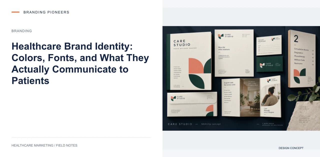
Patients form an opinion about your practice's competence within 50 milliseconds of seeing your website, logo, or signage. This snap judgment is almost entirely visual — colors, typography, layout, and imagery trigger automatic associations with professionalism, trust, and quality of care.
Patients consistently rate the medical competence of physicians higher when the website looks professional and current, compared to an outdated or amateur design. Your visual identity is not superficial decoration — it is a clinical trust signal.
The Healthcare Color Psychology Framework
Color choices in healthcare branding carry more weight than in most industries because patients are in heightened emotional states — anxious, uncertain, and looking for reassurance.
Blue: The most common healthcare color for good reason. Blue evokes trust, stability, and professionalism. It lowers heart rate and creates a sense of calm. Use deep navy for authority and prestige (hospitals, surgical centers) or lighter blues for approachability and warmth (pediatrics, family medicine).
Green: Associated with health, growth, and nature. Effective for wellness-focused practices, integrative medicine, and fertility clinics. Avoid neon greens, which feel clinical and cold. Sage and emerald greens feel organic and nurturing.
White: Clean, sterile, and modern. Essential as a primary background color in healthcare design, but insufficient on its own — all-white branding feels cold and institutional. Use white as a canvas with strategic color accents.
Purple: Associated with premium quality, wisdom, and innovation. Effective for specialty practices positioning themselves as centers of excellence. Common in oncology and neurology branding.
Warm neutrals: Beige, taupe, and soft gold communicate warmth, comfort, and approachability. Effective for patient-experience-focused brands, especially in cosmetic surgery, dentistry, and maternity care.
Colors to use carefully: Red (urgency and anxiety — use only as a small accent), black (authority but also cold — works in luxury cosmetic branding), and yellow (optimism but also caution — works in pediatrics and mental health).
Logo Design Principles for Healthcare
A healthcare logo must work harder than a typical business logo because it needs to communicate competence, care, and trust simultaneously.
Simplicity. The most effective healthcare logos are clean and uncluttered. They work at 16 pixels (browser favicon) and at 16 feet (building signage). If your logo requires a magnifying glass to appreciate its details, it is too complex.
Avoid cliches. Crosses, hearts, DNA helixes, stethoscopes, and caduceus symbols are used by thousands of healthcare brands. They do not differentiate — they blend. Instead, develop a distinctive mark that is unique to your practice while still evoking healthcare sensibilities through color, shape, and proportion.
Typography-first approach. Many of the most recognizable healthcare brands (Cleveland Clinic, Mayo Clinic, Johns Hopkins) use text-based logos with distinctive typography rather than graphic symbols. A strong wordmark is versatile, recognizable, and harder to confuse with competitors.
Monogram or lettermark. For practices with long names, a monogram (initials designed as a distinctive mark) can be effective. It creates a compact identity that works well as an app icon, social media avatar, and watermark.
Typography That Communicates Care
Font choices communicate personality before a single word is read:
Serif fonts (like Garamond or Playfair Display) communicate tradition, authority, and established expertise. Effective for hospitals and surgical practices that want to emphasize their legacy.
Sans-serif fonts (like Inter, Poppins, or Helvetica Neue) communicate modernity, cleanliness, and accessibility. Effective for contemporary clinics, telehealth platforms, and wellness brands.
Rounded sans-serif fonts (like Nunito or Comfortaa) communicate warmth, friendliness, and approachability. Effective for pediatrics, family medicine, and patient-experience-focused practices.
Use a maximum of two font families: one for headings and one for body text. More than two fonts creates visual chaos that undermines the sense of order and professionalism patients expect from a healthcare provider.
Photography and Imagery Guidelines
Stock photography has destroyed the visual credibility of countless healthcare websites. Patients can instantly identify generic stock photos of models in lab coats and react with skepticism.
Use real photos. Photograph your actual facility, your actual team, and your actual patients (with consent). Authentic photography builds trust that stock photos cannot.
Consistent style. Develop a photography style guide: warm or cool tones, candid or posed, bright or moody lighting. Apply this consistently across your website, social media, and print materials. Visual consistency signals organizational competence.
Diverse representation. Your imagery should reflect the diversity of your patient population. Patients feel more comfortable with providers whose marketing materials include people who look like them.
Environmental photography. Show your spaces — reception areas, consultation rooms, modern equipment. Patients want to see where they will be receiving care. Clean, well-lit facility photos reduce the uncertainty that prevents booking.
Building Brand Consistency
A visual identity is only effective when applied consistently across every touchpoint. Create a brand guidelines document that specifies: logo usage rules (minimum size, clear space, approved backgrounds), color values (Pantone, CMYK, RGB, and HEX for every brand color), typography specifications (font families, sizes, weights for every use case), photography style guidelines, and icon and illustration style guidelines.
Distribute these guidelines to every person and vendor who creates materials for your practice: your web designer, your social media manager, your print vendor, your signage company, and your advertising agency.
Inconsistent branding across touchpoints — a different blue on your website than on your building sign, a different logo on your WhatsApp profile than on your letterhead — erodes the professional impression you are trying to build. Consistency compounds trust; inconsistency erodes it.
Measuring Brand Identity Impact
After implementing or refreshing your visual identity, track these metrics over 6 months: website conversion rate (should improve as trust signals strengthen), patient satisfaction scores (often improve with environmental and brand upgrades), social media engagement rate (should increase with more polished, consistent visuals), and new patient volume (the ultimate measure of brand effectiveness).
A well-designed visual identity does not just look good — it communicates the quality of care patients will receive before they ever walk through your door.
Filed underhealthcare visual identitymedical practice brandinghealthcare logo designmedical brand design

About the author
Nishu Sharma
Founder & CEO · Gurugram, India
Nishu founded Branding Pioneers in 2016 with one rule that hasn't changed since: healthcare only. She'd run digital strategy at a top-10 Indian agency and watched generalist marketing underserve medical clients who needed something built for how patients actually search and decide. So she left to build the specialist instead. It's now an 80-person team working with healthcare brands worldwide.
Free guide · 17 pages
The Patient Acquisition Blueprint
A 90-day plan from first search to booked appointment.