The 8-Second Problem
A new visitor to your clinic's website decides within 8 seconds whether to stay or leave. In those 8 seconds, they form an opinion about your professionalism, trustworthiness, and whether you can help them with their specific concern. Most healthcare websites fail this test because they prioritize what the clinic wants to show rather than what the patient needs to find.
The result: 72 percent of healthcare website visitors leave without taking any action. They do not call, do not book, and do not submit a form. They simply bounce to the next result in Google. For a practice spending 2 lakhs per month on marketing to drive traffic, that is 1.44 lakhs wasted on visitors who leave empty-handed.
Fixing website UX is the highest-leverage investment in healthcare marketing because it improves the return on every traffic source simultaneously — SEO, paid ads, social media, and referrals all benefit.
Principle 1: The First Screen Must Answer Three Questions
When a patient lands on any page of your website, they need three questions answered within seconds: What does this practice do? Can they help with my specific problem? How do I take the next step?
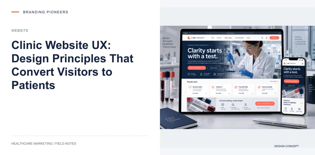
Your homepage's above-the-fold area must contain a clear value proposition (e.g., "Expert Orthopedic Care in South Delhi — Same-Week Appointments Available"), a prominent call-to-action (phone number and booking button both visible without scrolling), and visual trust signals (doctor photos, review ratings, accreditation logos).
Do not waste this premium space on rotating image carousels. Static hero sections with a clear CTA consistently outperform carousels in conversion rate. Carousels dilute attention and slow page load.
Principle 2: Navigation Organized Around Patient Needs
Most healthcare websites organize navigation around internal departments: Cardiology, Orthopedics, Neurology, etc. This makes sense to hospital administrators but confuses patients who do not know which department they need.
Consider a dual navigation approach: organize by condition (Knee Pain, Back Pain, Heart Problems, Skin Concerns) alongside traditional department navigation. When a patient clicks "Knee Pain," they land on a page that explains possible causes, available treatments, and which doctors can help — regardless of whether that falls under Orthopedics, Rheumatology, or Sports Medicine.
Practices that implement condition-based navigation see 15 to 25 percent improvements in pages per session and 10 to 15 percent improvements in conversion rate because patients find the right information faster.
Principle 3: Mobile-First, Not Mobile-Friendly
Over 75 percent of healthcare website traffic comes from mobile devices. Yet most healthcare websites are designed on desktop and then adapted for mobile. This backwards approach creates friction points that kill mobile conversion.
Design mobile-first. The most important elements: a sticky header with phone number and booking button visible at all times, touch-friendly buttons with minimum 44px tap targets, forms with no more than 4 fields that use appropriate mobile keyboard types (numeric keyboard for phone number, email keyboard for email), and content formatted for vertical scrolling — no horizontal swipe galleries or multi-column layouts.
Test your website on a mid-range Android device, not just your iPhone. In India, the majority of patients browse on budget Android phones with smaller screens and slower processors. If your site works smoothly on a 10,000-rupee Android phone, it works for everyone.
Principle 4: Reduce Booking Friction to Zero
Every additional step between "I want to book" and "I have booked" costs you roughly 20 percent of potential patients. The ideal booking flow is three steps or fewer: click "Book Appointment," select date and time, confirm.
Offer multiple booking channels visible on every page: online booking widget, click-to-call, and WhatsApp. Different patients prefer different channels. Forcing everyone through a single booking method excludes patients who prefer alternatives.
For practices using Practo, Zocdoc, or a custom booking system, embed the booking widget directly on your website rather than linking to an external platform. Each redirect to an external site costs 30 to 40 percent of potential conversions due to increased friction and decreased trust.
Principle 5: Speed Is a Feature
Page load speed directly impacts both SEO rankings and patient conversion. A healthcare website that loads in 2 seconds converts at nearly double the rate of one that loads in 5 seconds. Google's Core Web Vitals — Largest Contentful Paint, First Input Delay, and Cumulative Layout Shift — are ranking factors that directly affect your visibility.
The most common speed killers on healthcare websites: uncompressed images (compress all images to WebP format), unoptimized third-party scripts (chat widgets, analytics, social embeds), render-blocking CSS and JavaScript, and heavy custom fonts.
Run your website through Google PageSpeed Insights and address every issue flagged as "Opportunity" or "Diagnostic." Aim for a performance score of 85+ on mobile. This is achievable for every healthcare website with competent development work.
Principle 6: Trust Signals on Every Page
Patients are making a health decision — trust is everything. Display trust signals consistently across your website, not just on the homepage:
Physician credentials: Every service page should mention the treating doctor's qualifications, board certifications, and years of experience.
Patient reviews: Display Google review rating and total count in the header or sidebar of every page. Link to your Google review profile for verification.
Accreditations: NABH, JCI, ISO, or relevant national accreditation logos should appear in the footer of every page.
Security indicators: HTTPS badge, privacy policy link, and HIPAA compliance notice on forms.
Practices that add trust signals to all pages (not just the homepage) see 20 to 30 percent improvement in site-wide conversion rates.
Principle 7: Content That Guides the Patient Journey
Your website should guide patients through a natural decision process: understand my condition, learn about treatment options, evaluate this provider, and book an appointment. Each stage needs appropriate content:
Awareness stage: Condition and symptom pages that explain when to seek help. Consideration stage: Treatment option pages that compare approaches and set expectations. Decision stage: Doctor profile pages with qualifications and registration details, factual fee information, and accreditation and facility details that build confidence. (In India, skip testimonial and before-and-after galleries: NMC's 2026 guidelines bar them for doctors and hospitals — see our NMC guidelines summary.) Action stage: Booking pages with minimal friction and maximum urgency.
Use clear internal links and CTAs to guide patients from one stage to the next. A condition page should link to the relevant treatment page, which should link to the doctor profile, which should link to the booking page. This guided pathway increases conversion by ensuring patients never hit a dead end.
Measuring UX Impact
After implementing UX improvements, track these metrics weekly for 8 weeks: bounce rate by page, average time on site, pages per session, conversion rate (appointments booked divided by unique visitors), and phone calls from website. Compare against your baseline from the 4 weeks before implementation.
Expect to see bounce rate decrease by 15 to 30 percent, time on site increase by 20 to 40 percent, and conversion rate improve by 25 to 50 percent. These improvements compound — a 30 percent reduction in bounce rate combined with a 30 percent improvement in conversion means roughly 70 percent more appointments from the same traffic volume.
Filed underclinic website UXhealthcare website designmedical website conversionpatient experience website

About the author
Arush Thapar
Co-Founder & CTO · Gurugram, India
Arush builds the systems the rest of the company runs on — the patient-acquisition pipelines, the AI chatbots, the analytics that tie a single click to a booked appointment. If a campaign reports a number, it's because something his team built is tracking it.
Free guide · 15 pages
WhatsApp AI Chatbot for Hospitals (14-Day Deploy)
The 14-day WhatsApp booking-bot implementation playbook.