A medical website has two jobs: let a patient book without friction, and let a search engine understand what each page is for. These posts are about both, including the accessibility requirements that apply to healthcare providers specifically.
Published by Branding Pioneers · Published topic archive and article metadata
A practical reference for this page
01
Start hereHealthcare websites
02
Establish contextUse the published scope and relevant source material
03
Choose the next stepFollow the linked resource and assign an owner
Use the website reading collection
A medical website has two jobs: let a patient book without friction, and let a search engine understand what each page is for. These posts are about both, including the accessibility requirements that apply to healthcare providers specifically. This page is part of a collection containing 15 published articles. The archive groups them under website and keeps links to the complete articles so a short card can lead into the full explanation. Treat the card as an introduction to the question, not as the full recommendation or its supporting evidence.
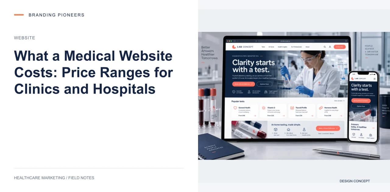
On this archive page, examples include What a Medical Website Costs: Price Ranges for Clinics and Hospitals; Accessible Clinic Appointment Forms: Fix the Booking Step First; Hospital Service Line Pages: Build for the Patient's Next Decision. Choose the article whose question is closest to the decision you are making. Read its source context and implementation details before assigning a task, and identify which assumptions depend on your service mix, location or operational process. If the article includes a tool or case example, follow that reference so its definitions and limits stay attached to the conclusion.
Design the website around a real patient task
Start with the task a visitor needs to complete. Finding a treatment, checking a clinician’s background, identifying a location and asking for an appointment are related tasks, but they need different information. Make those paths visible in the navigation and on the relevant service pages. A good brief includes the content and the operational destination of each action: who receives the form, what happens after submission and how a visitor obtains help when the first contact route fails.
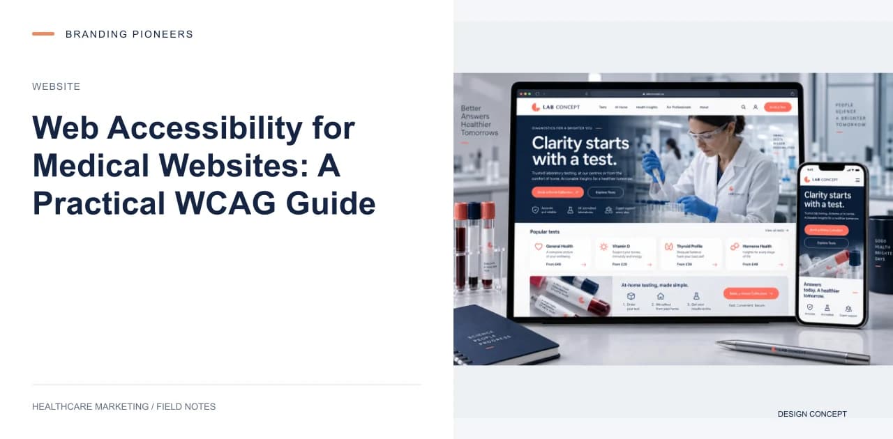
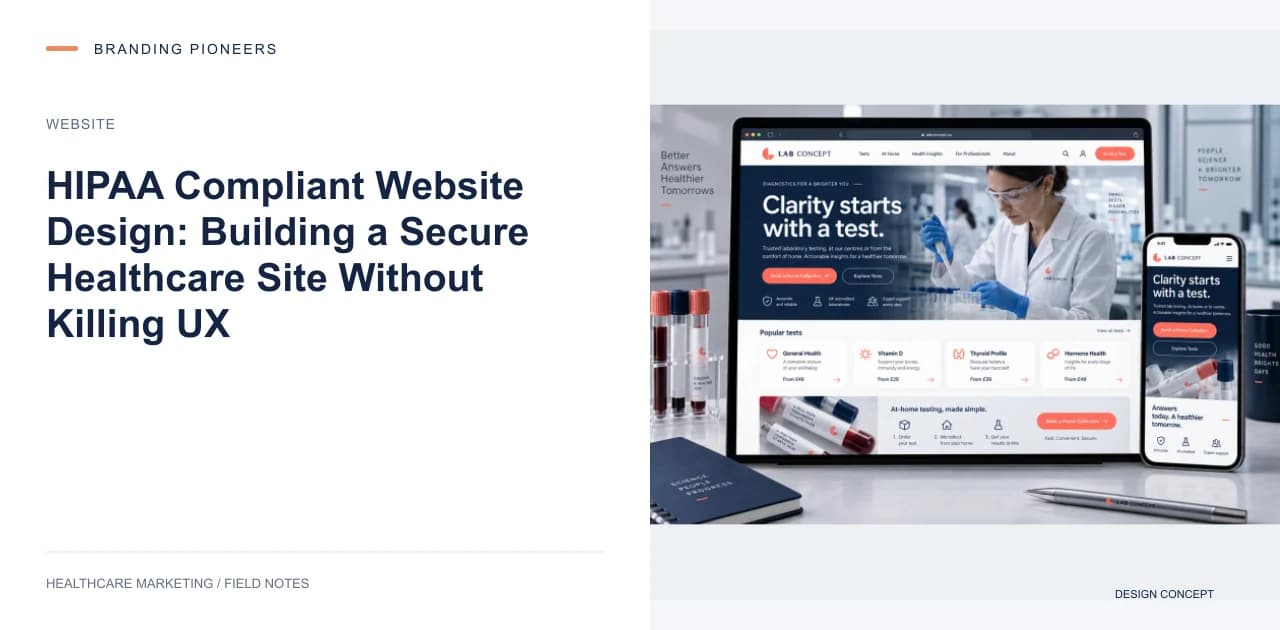
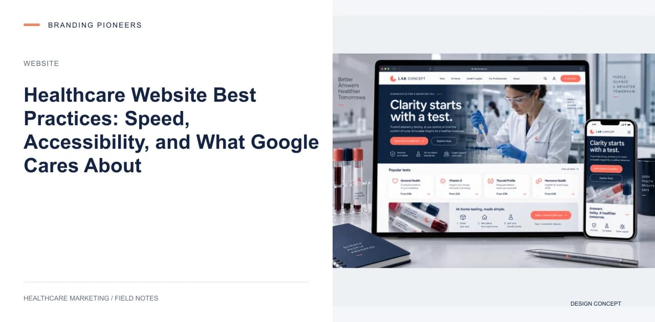
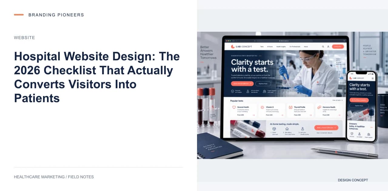
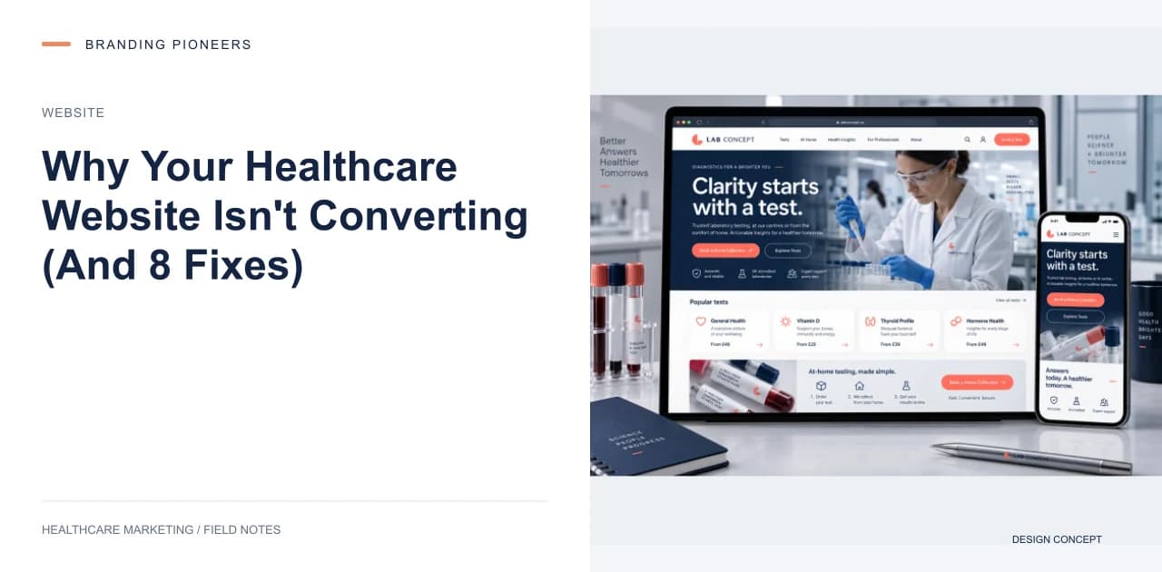
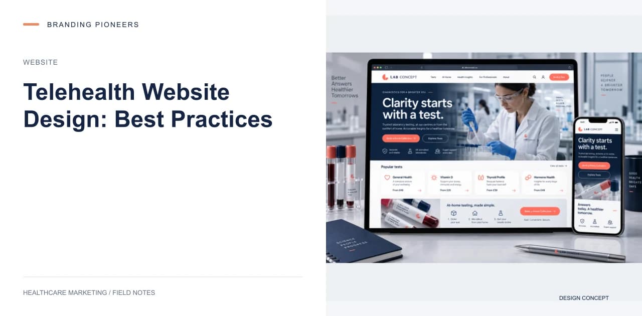
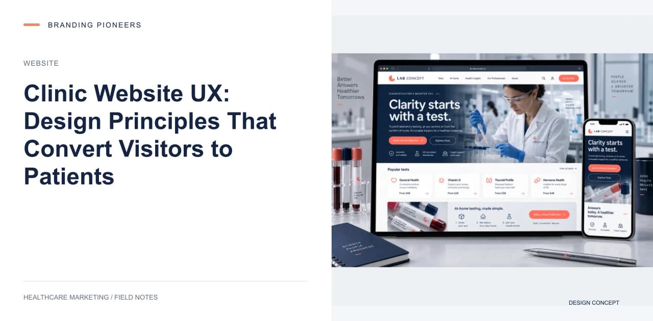
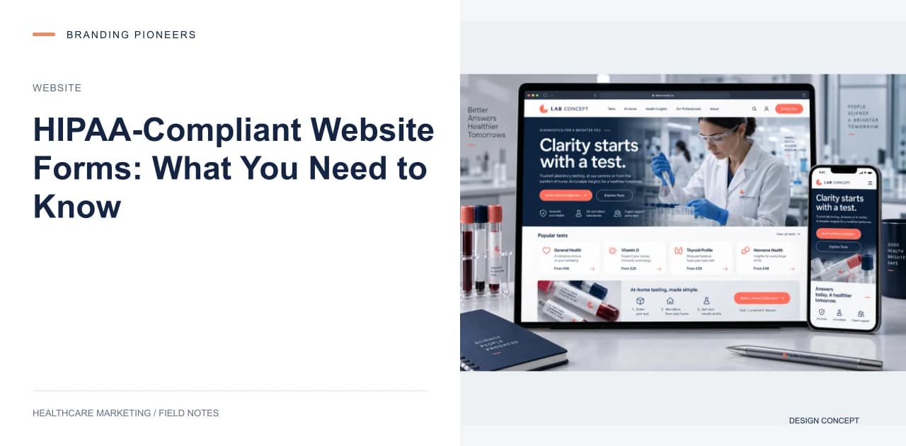
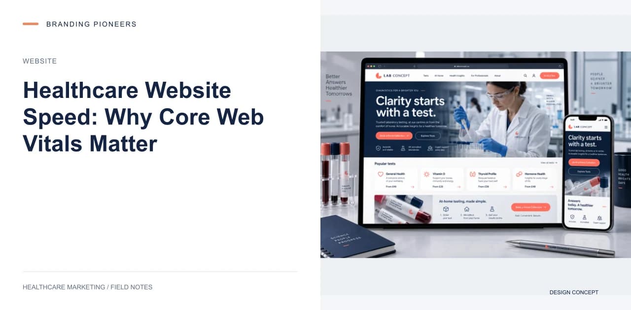
Desktop screens help explain page hierarchy, but they cannot establish the quality of the mobile experience. Check readable text, tap targets, menu behaviour and form validation on a phone. Long doctor biographies and treatment descriptions should remain easy to scan without hiding important details in decorative interactions. When a collection shows both desktop and mobile artwork, compare the priority of information across them. The mobile layout should preserve useful content rather than simply shrink the desktop composition.
Supporting client example: LifeCare Hospitals · SEO + Web. See the linked case file for the source context.