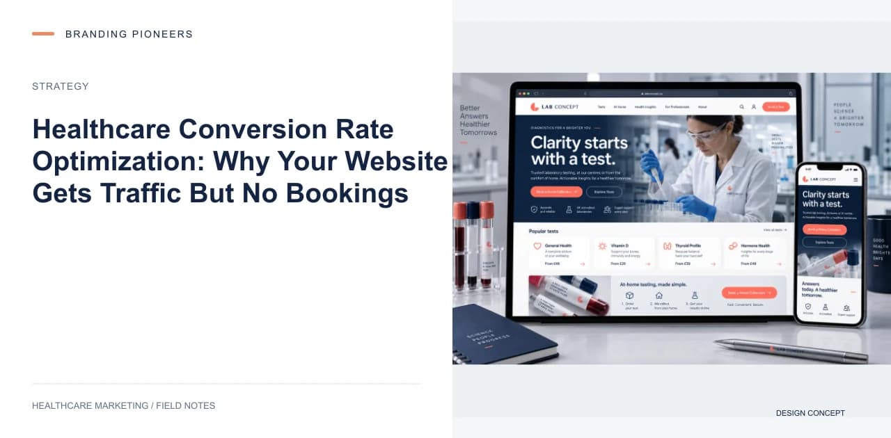
Take a hospital getting 48,000 website visitors per month, with appointment bookings of just 190 — a conversion rate of 0.39%.
The industry benchmark for healthcare websites is 2–4%. At 2%, they should have been getting 960 bookings. At 4%, 1,920.
They were getting 190.
This is not a traffic problem. This is a conversion problem. And it's one of the most common — and most fixable — problems in healthcare marketing.
What Conversion Rate Optimization Actually Means
CRO is not about making your website look prettier. It's about understanding why visitors don't take the action you want them to take — and removing those barriers one by one.
In healthcare, the primary conversion is an appointment booking. Secondary conversions include phone calls, WhatsApp messages, and contact form submissions.
The goal of CRO is to take your existing traffic and make more of it convert — without spending a single rupee more on advertising.
If you spend ₹10 lakhs/month on Google Ads and your website converts at 1%, you're getting roughly 5,000 leads from that spend (assuming 50,000 clicks at ₹20 CPC — adjust for your actual CPC). At 2%, you'd get 10,000 leads. Same spend. Double the output.
The 9 Conversion Killers in Healthcare Websites
1. Homepage as Landing Page
Sending ad traffic to your homepage is the single biggest CRO mistake in healthcare. Your homepage is for branding. It serves 12 different audiences — patients, doctors, insurers, job seekers, investors. It's optimized for nobody.
Procedure-specific landing pages generally convert far better than homepages do. Always send paid traffic to specific landing pages.
2. No Online Booking
A large share of patients under 45 prefer to book online. If your only option is a phone call, you're losing many potential patients before they even engage.
The solution isn't necessarily a complex hospital management system. A simple form with 3 fields (name, phone, preferred specialty) with a confirmation SMS is enough to capture the lead. You can refine the appointment over the phone.
3. Slow Page Load Speed
A 1-second delay in mobile page load can meaningfully increase bounce rate. Healthcare sites often load slowly because of large, unoptimized images, old servers, and poorly coded booking systems.
Target: under 2.5 seconds load time on mobile (LCP). Use Google PageSpeed Insights to check where you stand.
That same hospital's mobile page load time was 7.2 seconds. After optimization to 2.4 seconds, their mobile conversion rate went from 0.28% to 1.6% — a dramatic improvement with no changes to the copy or design.
4. No Trust Signals at the Point of Decision
Patients making healthcare decisions are anxious. They're making a high-stakes choice. The moment they're about to click "Book Appointment," they need reassurance.
Most hospital websites put trust signals — accreditations, reviews, doctor credentials — on the About page. By the time a patient reaches the booking form, they're on a different page with no trust signals nearby.
Fix: Put your accreditation status (NABH, JCI), the doctor's qualifications and registration number, and a clear cost range on every landing page and near every booking form.
Patient testimonials used to be the standard answer here. Since NMC's guidelines of 6 October 2026, Indian doctors and hospitals shouldn't use them for promotion, even with the patient's consent (Expl. V to para 3.2; para 6.2) — see our NMC guide. A short explainer video near the booking button, with the doctor describing what the appointment involves and the disclosure line on screen, answers the question anxious patients actually have.
5. Too Many Form Fields
Standard hospital contact forms ask for: name, email, phone, date of birth, insurance provider, preferred doctor, department, preferred date, preferred time, and "how did you hear about us."
That's 10 fields. Patients abandon multi-field forms at a noticeably higher rate for every additional field beyond 3.
Rule: 3 fields maximum for the initial booking form. Name, phone, and preferred specialty or date. Collect the rest over the phone.
6. No WhatsApp Option
Many patients who don't fill in a form will message on WhatsApp if the option is visible. A floating WhatsApp button converts visitors who wouldn't otherwise contact you.
At minimum, add a floating WhatsApp button that pre-fills a message like "Hi, I'd like to book an appointment" with your hospital name included.
7. Generic CTAs
"Contact Us" is not a CTA. "Learn More" is not a CTA. "Click Here" is not a CTA.
Specific CTAs convert dramatically better:
- "Book a Free Cardiology Consultation" → performs far better than "Contact Us"
- "Check Availability for Knee Replacement" → performs far better than "Learn More"
- "WhatsApp Dr. Mehta's Team" → performs far better than a generic "Chat Now"
Every button on your website should tell the visitor exactly what happens next.
8. No Mobile Optimization
The large majority of healthcare website traffic is now mobile. If your website isn't designed mobile-first — meaning the mobile experience is prioritized over desktop — you're losing the majority of your visitors.
Specific mobile issues that kill conversions:
- Phone numbers that aren't click-to-call
- Forms that require zooming in to fill
- Booking buttons that appear below the fold
- Navigation menus that don't work on touchscreens
9. No Follow-Up for Incomplete Conversions
Someone visits your site, starts filling in a form, and abandons. You know nothing about them. That's a missed opportunity.
With basic analytics setup, you can:
- Run Google Ads remarketing to re-engage visitors who visited your booking page but didn't convert
- Set up abandoned form tracking and trigger a WhatsApp or SMS nudge
- Create Facebook custom audiences of website visitors for retargeting
That same hospital added remarketing campaigns targeting booking page visitors. These campaigns converted at 4.8% — far higher than the cold traffic rate — and cost meaningfully less per conversion.